Healthcare management system
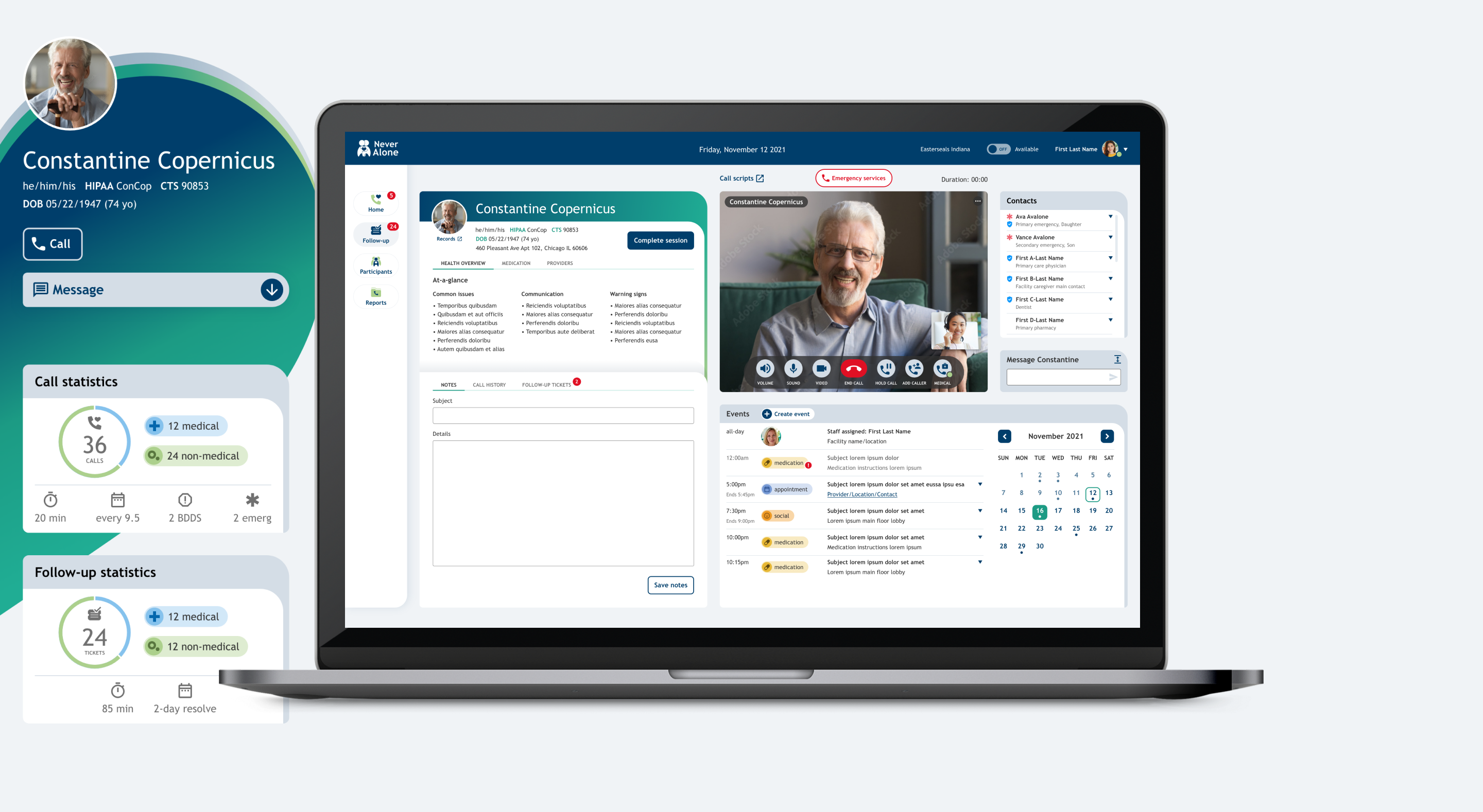
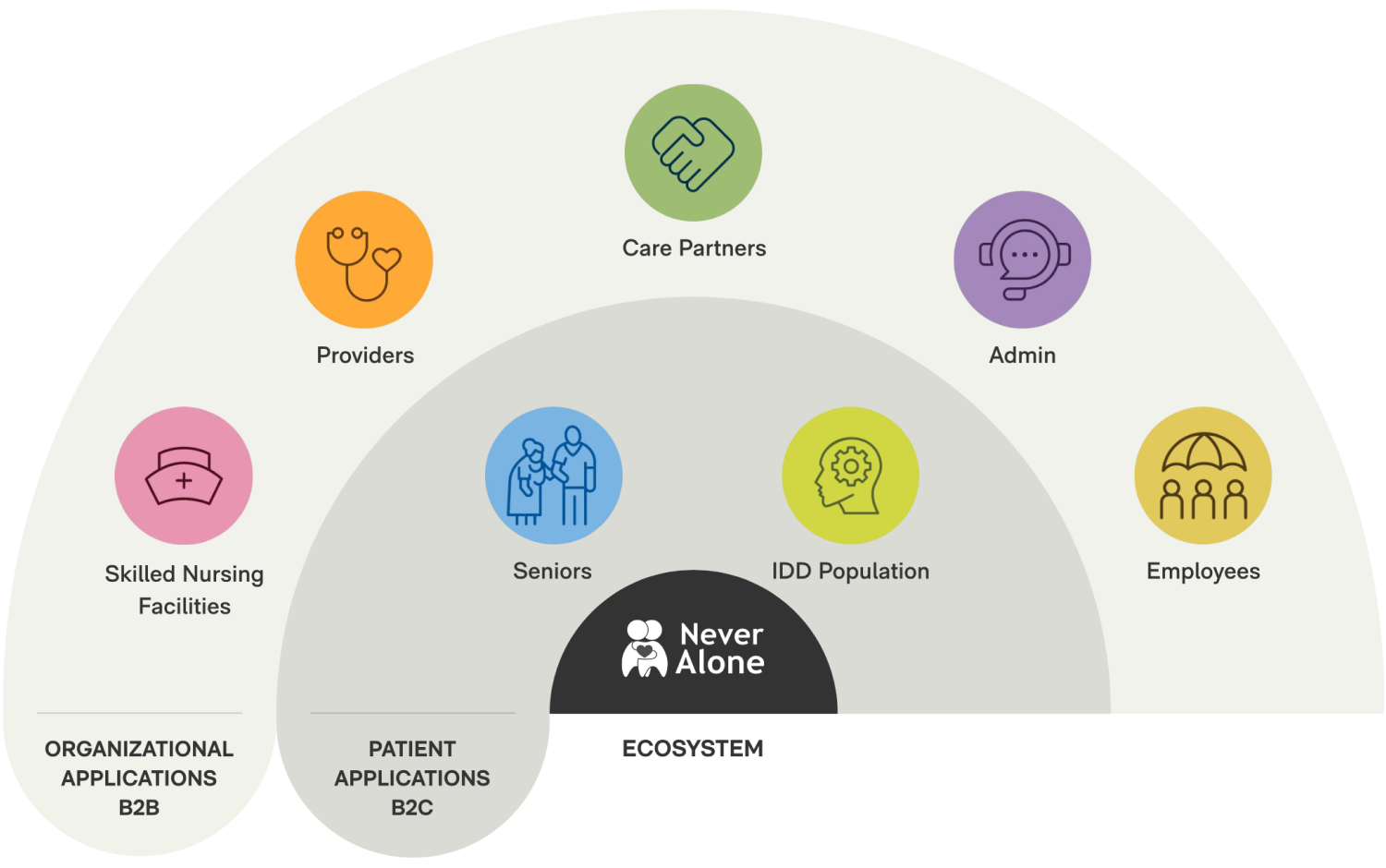
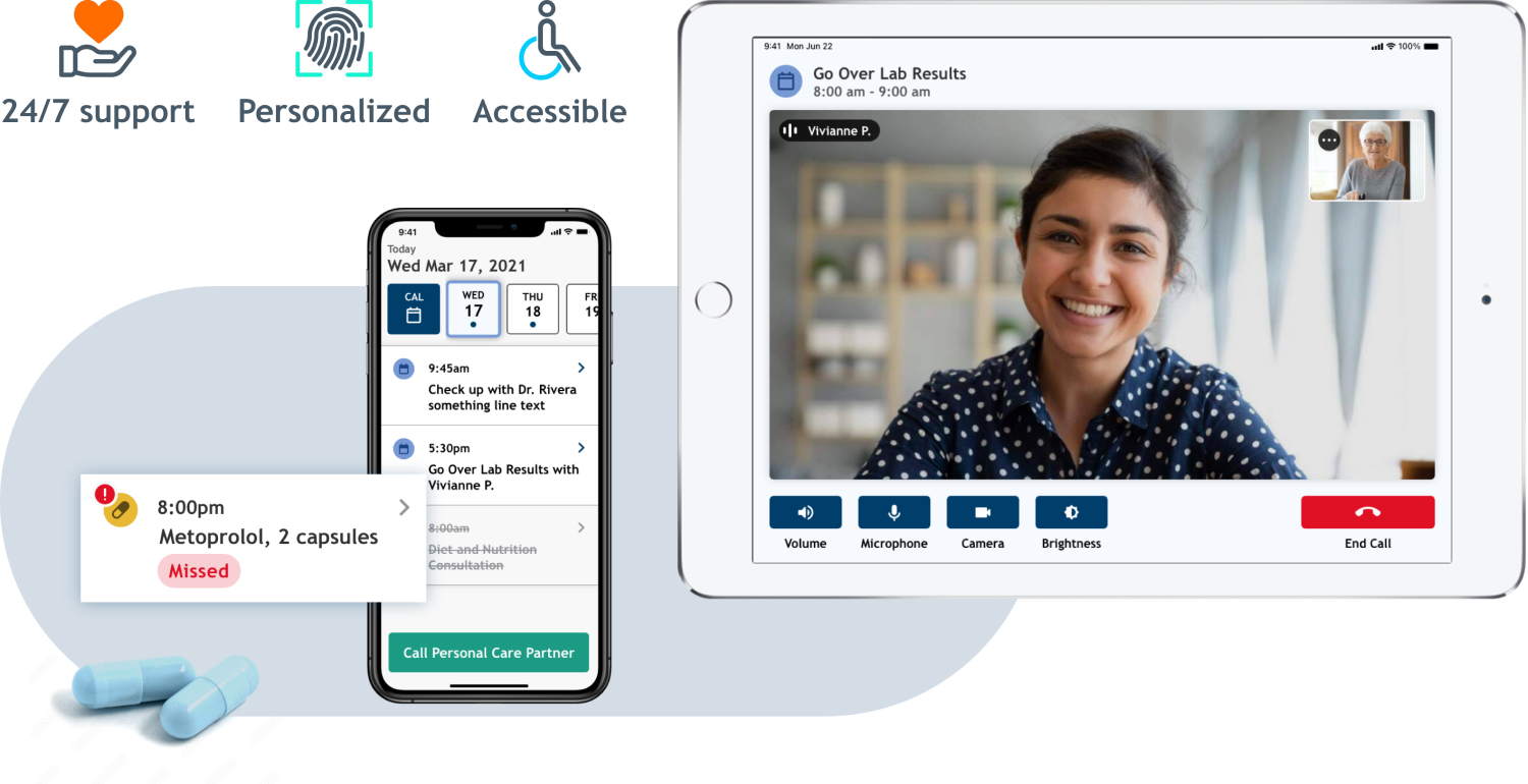
CommuniCare Health Services envisioned a new, in-home care service with 24/7 access that would help seniors and people with intellectual and developmental disabilities (IDD) live independently longer. They initially partnered with us to create a two-way remote patient monitoring platform to connect users with a personal care partner who can immediately triage their health, social, and local transportation needs. I designed the remote patient monitoring platform for this service, Never Alone, that became part of a care management ecosystem.
ROLE
Lead Product Designer
Accessibility SME
MY DELIVERABLES
Information architecture
User flows
Wireframes
Branding
Interactive prototype
User manual
CLIENT
CHS (Communicare Health Services)
One of the nation’s largest providers of post-acute care, which includes skilled nursing rehabilitation centers, long-term care centers, long-term acute care hospitals, assisted living communities, and independent living communities.
The challenge
This was a new product offering for the personal care support team that needed to complement the telehealth app functionality for seniors and IDD.
New product offering ambiguity
In addition to understanding the telehealth app features to support, I needed to understand and prioritize the needs of personal care partners. However, the research scheduled for this user had been delayed—but not my prototype. This meant that I would have to explore a different approach to understand their needs.
We needed this… yesterday
The design of the remote patient monitoring platform was a priority since it delayed the release of the patient app. On a personal note, this was my first project with my employer, and I was taking over efforts started by a former employee. We were already behind, but after assessing the quality of the work, I proposed to start from scratch to deliver better user and business value.
Building a foundation from humble beginnings
Designing workflows with a lack of data
I quickly onboarded by processing business goals and the complementary patient app features. Since we didn’t have personal care partner data yet and I didn’t have experience designing a call center, I decided to perform competitor research. This helped me analyze features that would best support managing patient requests and relationships. I then proposed workflows for managing patient calls, requests, and follow-up tickets.
Defining structure and interactions
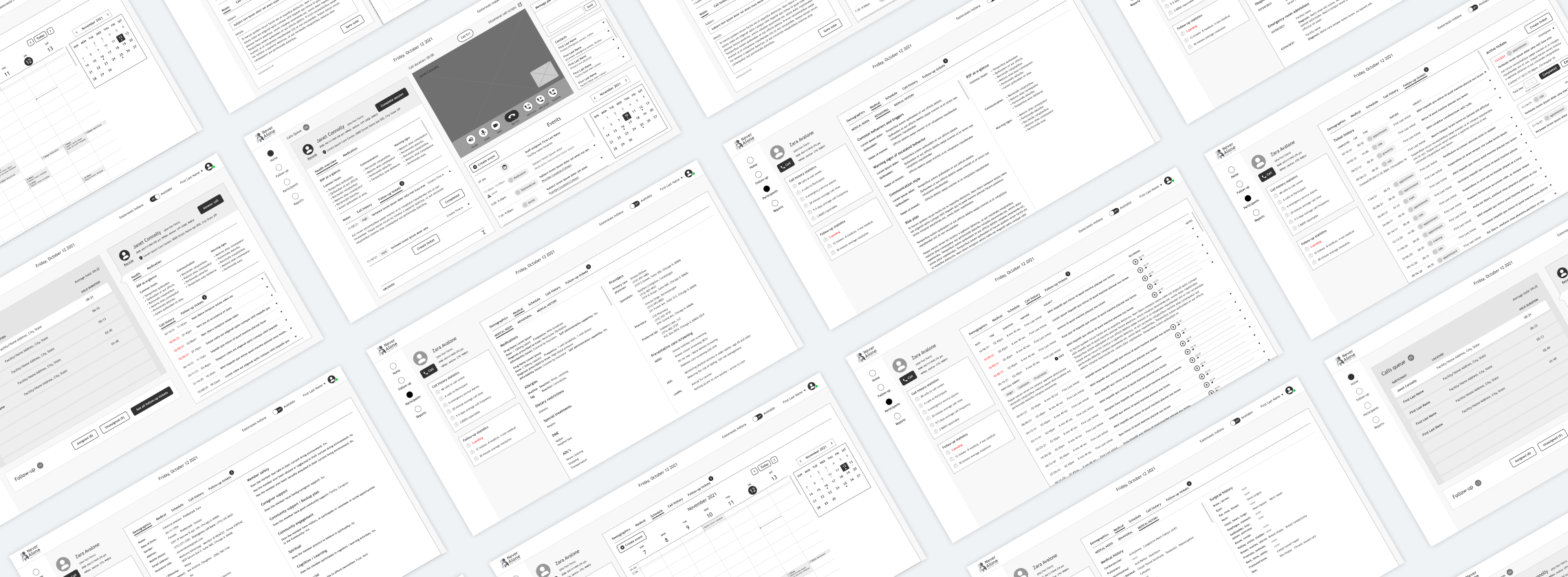
Once I defined the information architecture, I designed wireframes that prioritized my solutions for the quick-turnaround MVP.
- Critical features that complemented the existing patient tablet app
- Simple workflows for managing patient calls and requests
- Defined archived data and organization
- Critical customer relationship management content and features
Meaningfully expanding branding
Never Alone’s branding consisted solely of a very limited color palette and a logo. I evolved the color palette for meaningful coding in addition to iconography to meet accessibility guidelines. Accessibility was definitely a priority, considering our senior and IDD users.
I also introduced gradients, arcs, and softer hues to evoke a friendlier aesthetic in contrast to clinical content. I aimed for a unique design to differentiate Never Alone from competitor offerings.

Innovation with “the panel”
How it started
What the team struggled to resolve before I came on board was the most efficient way to view critical patient data without leaving the call queue and before initiating the video session. My slick solution was to place a patient data panel to the right of the call queue, and when a call was answered, it would slide and anchor to the left to reveal the video screen and supporting tools. This also helped guide users from left to right for the next actions.

One thing led to another…
The interaction and content of the panel became an element that I repeated in all three sections of the platform. The beauty of the panel was that it reinforced a consistent layout and interactions.
I also came up with a tabbed section whose default view changed based on context. For the call queue, the default tab was “call history.” Then, when the video session was initiated, the default tab was “notes.” In the follow-up section, the default tab was “follow-up tickets.”

Supporting patients through the call center
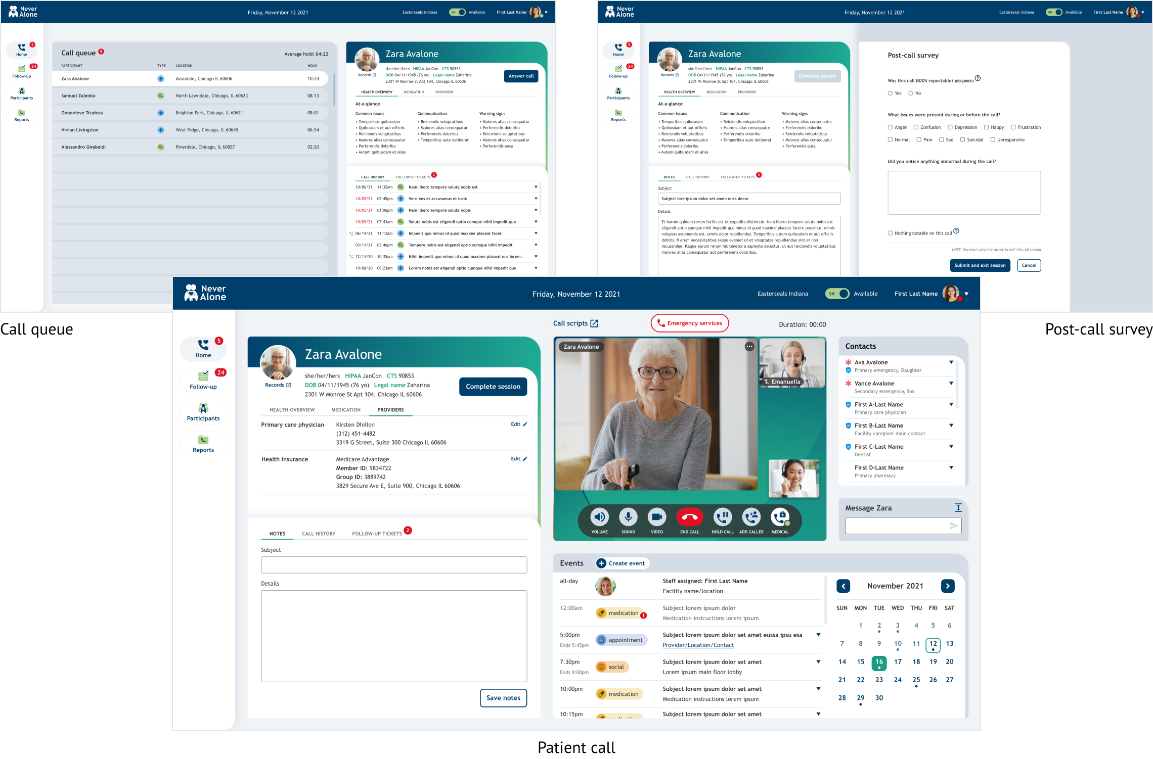
The link to the patient telehealth app was the call center—from the call queue to patient support to the mandatory post-call survey. These are some of my solutions that best supported business and consumer needs:
- Simple and intuitive queue system that prioritized calls and immediately prepared personal care partners with critical patient information before answering
- Strong organization, visual hierarchy, and micro-interactions to guide users seamlessly in prioritizing actions
- Easily accessible support features for video sessions such as notes, emergency services, contacts, and call scripts
- Synced patient’s calendar to help support, add, and edit events
- Condensed views for previous interaction context such as notes, calls, and tickets
- Simple workflow to create follow-up tickets
Follow-up ticket management
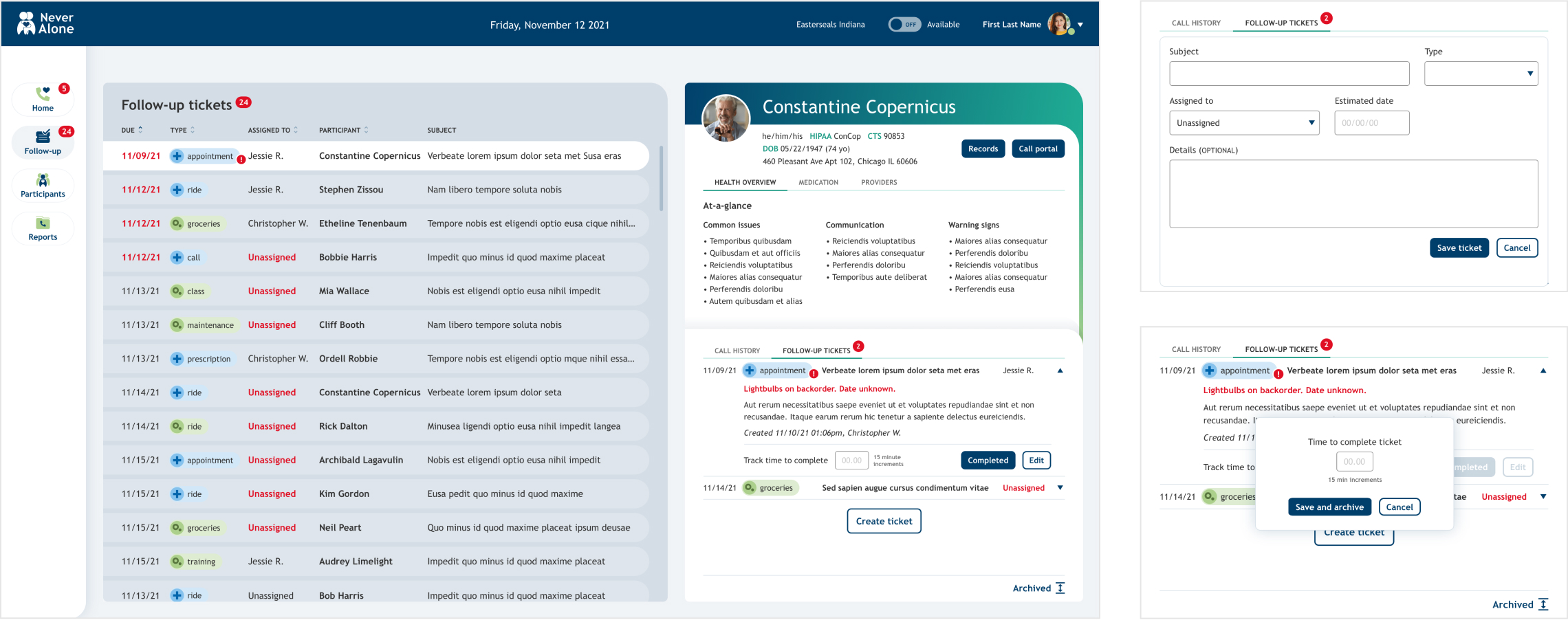
I designed a simple workflow for managing tickets. This included a queue for prioritization and “the panel” for ticket assignment, edits, resolution, alerts, and time tracking. This created an efficient process for agents to keep track of tickets and for managers to assess performance. These are some of my solutions:
- Duplicated the queue and panel concept to easily prioritize and manage follow-up tickets
- Simple flow to view and resolve tickets without leaving the queue dashboard
- Time tracking for performance evaluation by management
- Capturing, measuring, and archiving important historical data
- Actionable alerts and status to improve ticket management and patient experience
Patient relationship management and data
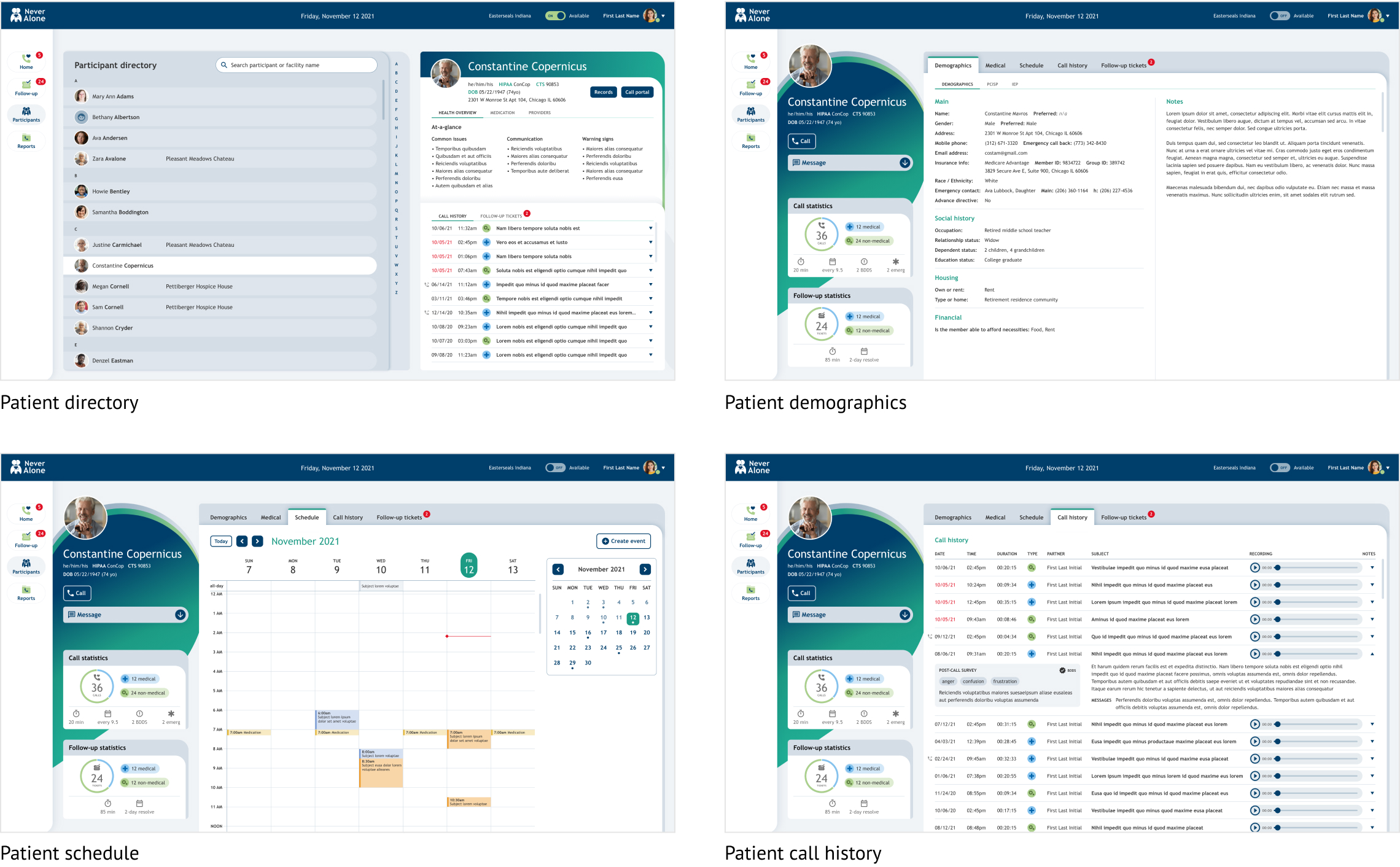
I designed a patient directory with integrations for individual analytics, demographics, medical information, schedule, call history, and follow-up tickets. This efficiently presented a thorough profile of each patient. These are some of my solutions:
- Consistent user experience for directory and patient overview that duplicates dashboard interactions for calls and tickets
- Persistent patient panel for easy access to the most important information, actions, and data visualizations
- Scalable layout for detailed views of calendar, call history, and tickets
Bringing it together in a call center user manual
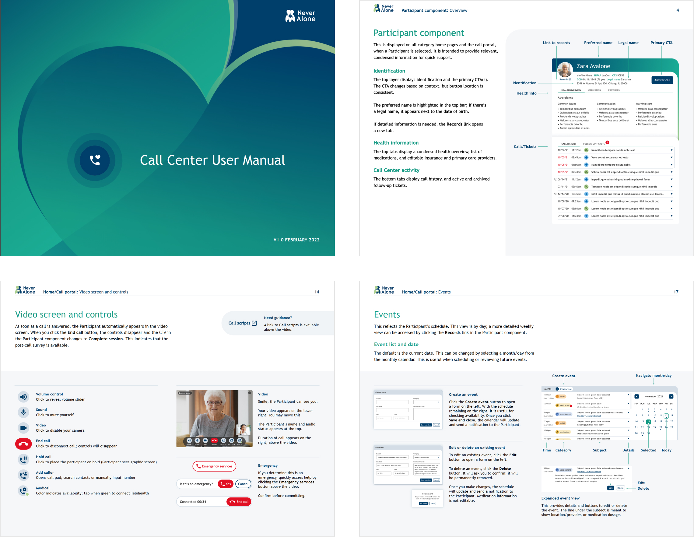
I designed a 32-page call center user manual to help train providers. My goal was to simplify the complexity of features by clearly organizing sections and making content easily scannable. The client was thrilled with the clear, well-organized, branded instructions.
The outcome
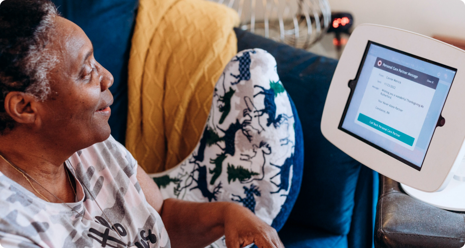
Due to the success of this pilot, we continued to scale to a full telehealth support communication ecosystem to support Never Alone’s increasing user base and expanding network.

Central to this ecosystem is the Care Management Platform that I designed, a CRM that manages user data and interactions across the Never Alone ecosystem. It also replaced Salesforce and third-party applications to offer personalized service and continuity of care across social and medical needs.