GreatCall Business Center
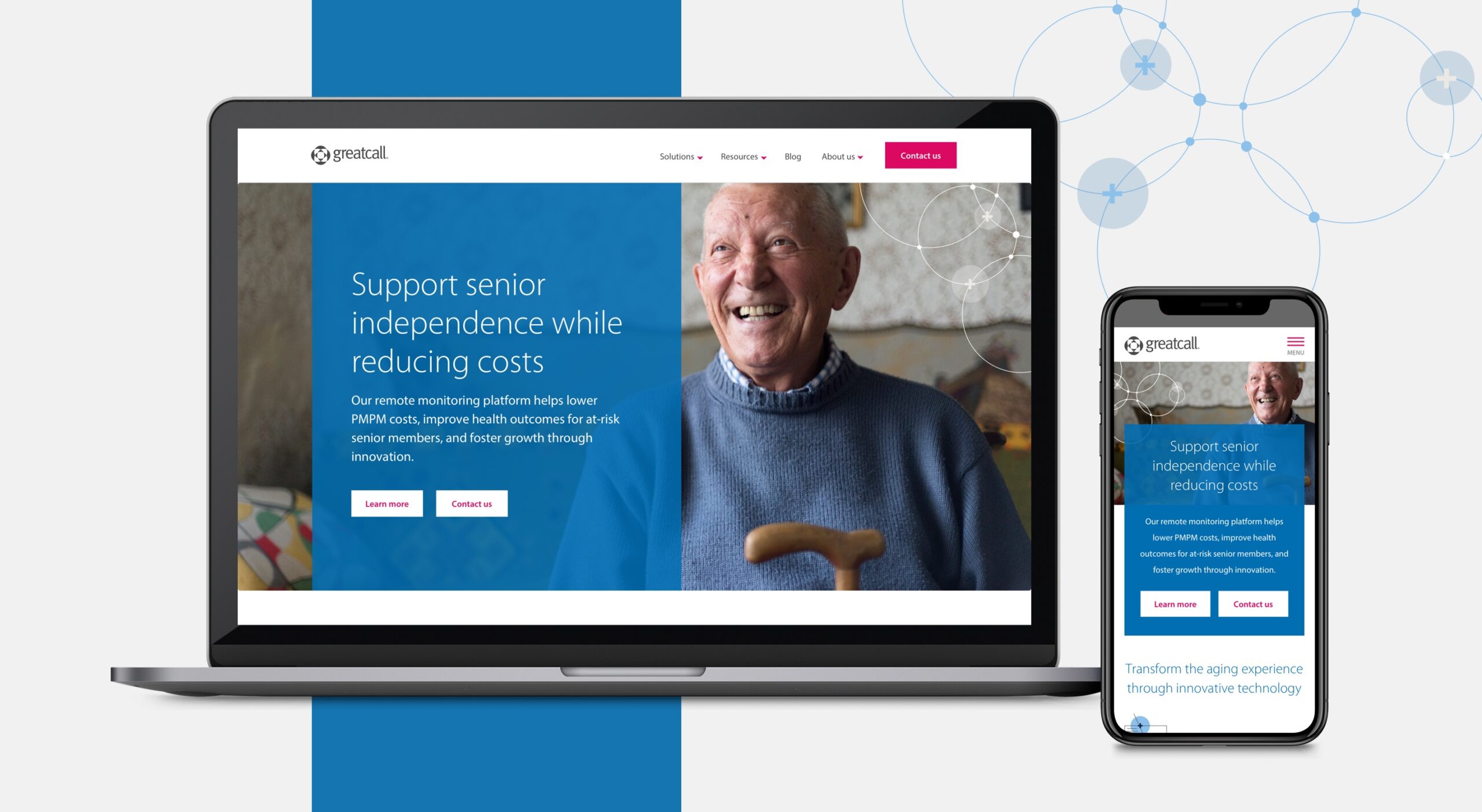
Our marketing agency designed a new B2B website for a senior-focused tech company that provides connected healthcare solutions and establishes them as leaders in their industry.
The challenge
Our client wanted to consolidate multiple B2B product sites into a unified brand experience, increase conversions and grow their reputation as thought leaders in their field. This needed to serve decision-makers for both assisted living and hospitals. The strategy team proposed a new B2B website to highlight their solutions, including a resource hub for ongoing nurture.
ROLE
Lead UX/UI Designer
Accessibility SME
Art Director
MY DELIVERABLES
Information architecture
Wireframes
Website prototype
UI kit
CLIENT
GreatCall (rebranded to Lively)
Connected health technology company that provides aging adults with accessible technology and services.
Setting the foundation
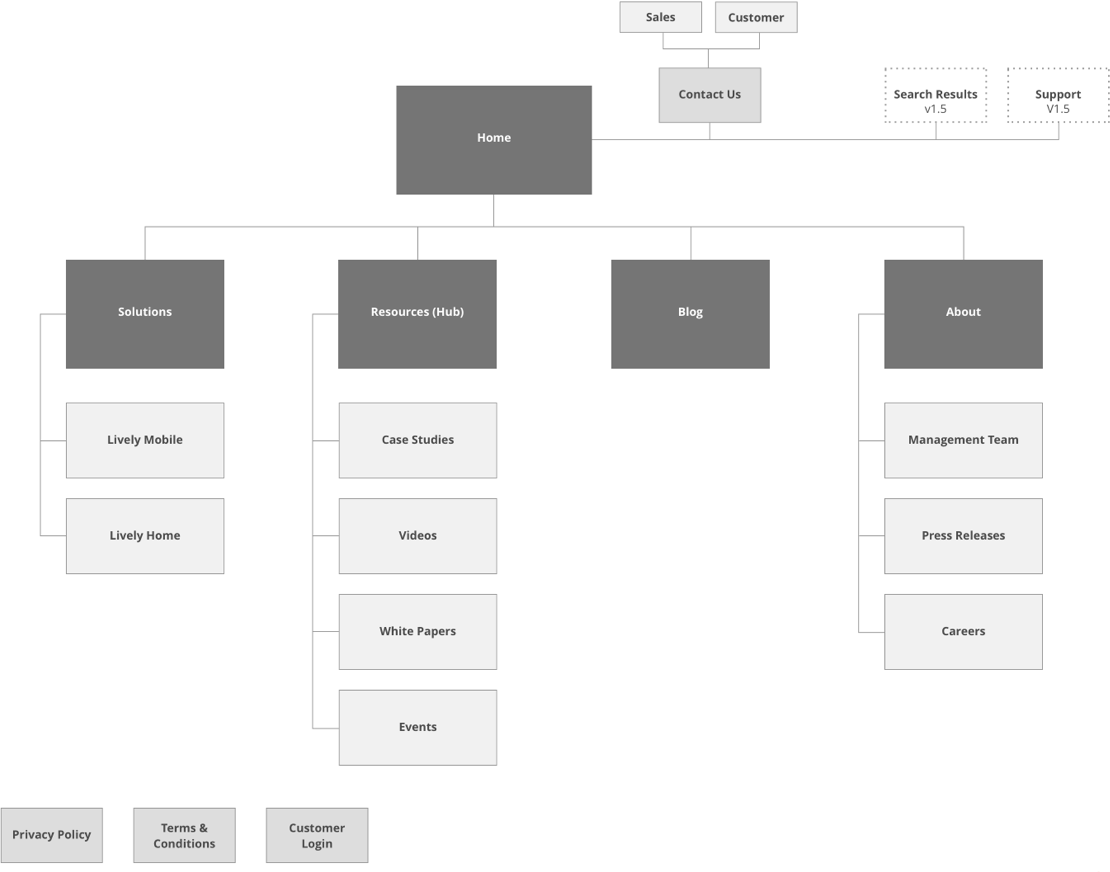
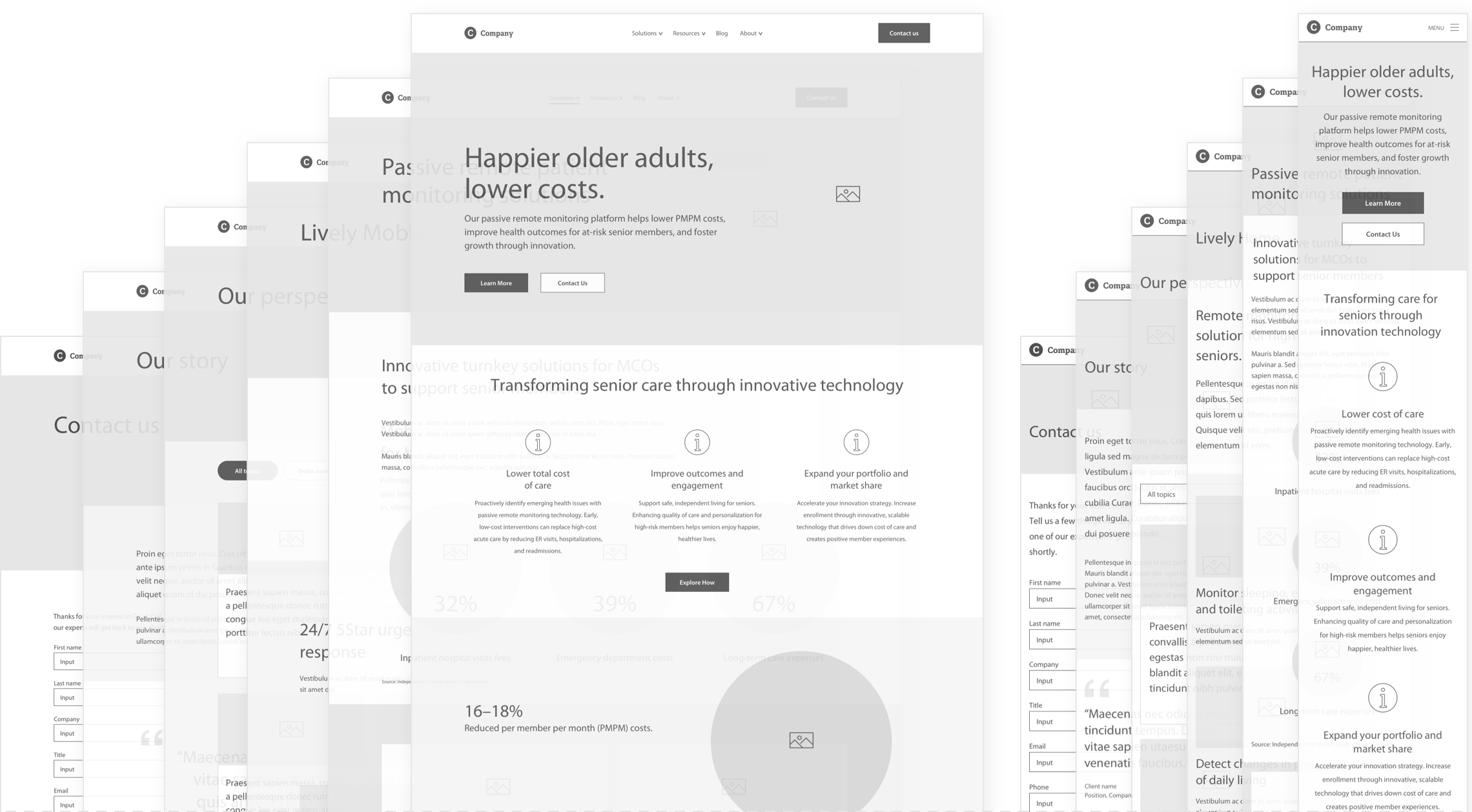
I collaborated with a content strategist and writer to establish the structure of the website. I created a sitemap, then created wireframes to present the structure of the site, hierarchy of content and interactions to the client. I recommended a modular approach and identified all the unique modules and templates. My goal was to create flexibility, consistency and efficiency.
Establishing the mood
I collaborated with an Art Director to establish the visual attributes of the brand experience and designed mockups for the client to select a visual direction. This B2B website would have a unique brand identity, while complementing their B2C website. I also proposed use of animated infographics as an engaging way to tell their story.
Introducing the visual experience
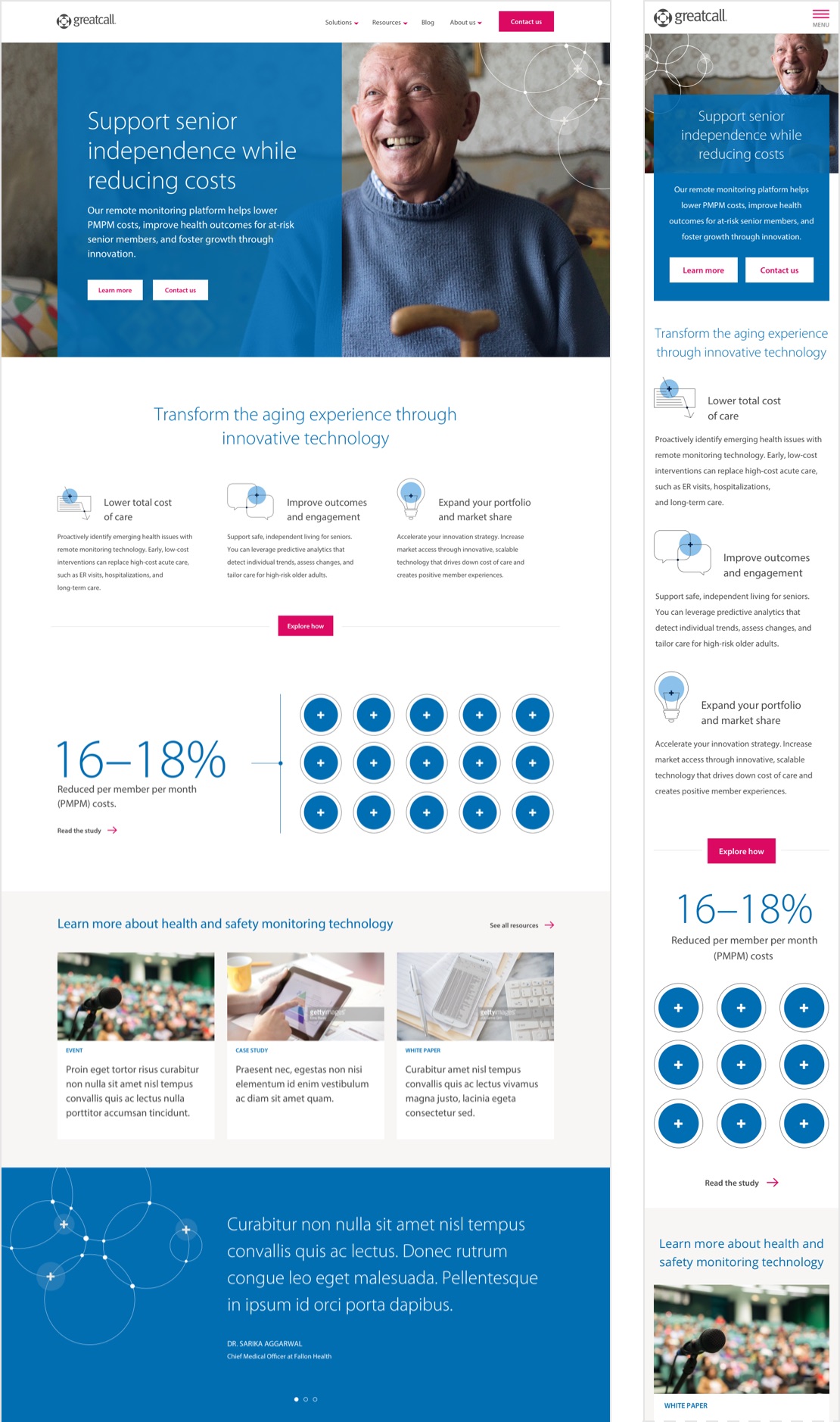
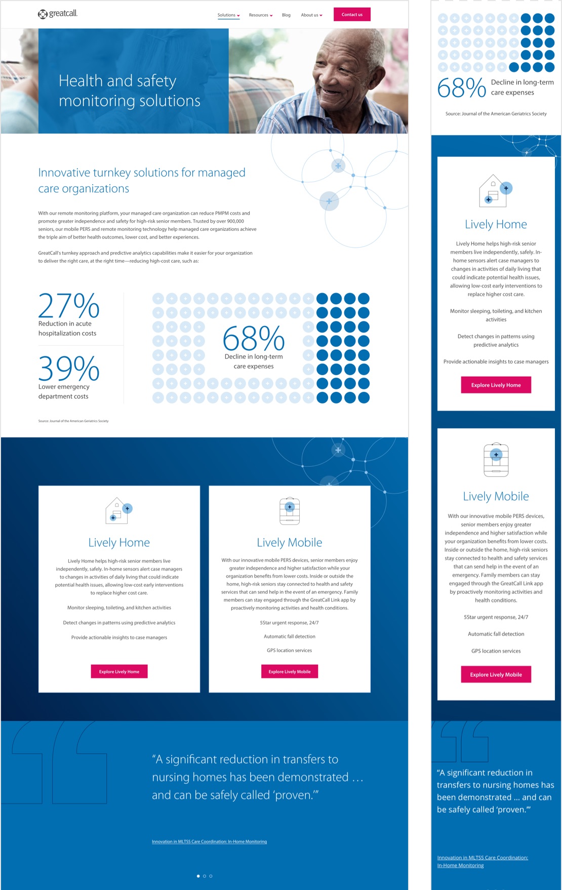
My strategy for the home page was to design a clean, uncluttered path to guide customers. I established a clear hierarchy, visually highlighting benefits and features, and CTA’s. I also made sure we followed accessibility standards for design.
I collaborated with the Art Director and illustrator to create visual assets to support statistics and features.
Highlighting solutions
One of the goals was to highlight the two solutions—Lively Home for remote monitoring, and Lively Mobile for greater independence. I designed the solutions page to clearly distinguish these two paths. I designed the solutions detail pages to have a clear, consistent experience in addition to supporting animations for engagement.
Resource hub
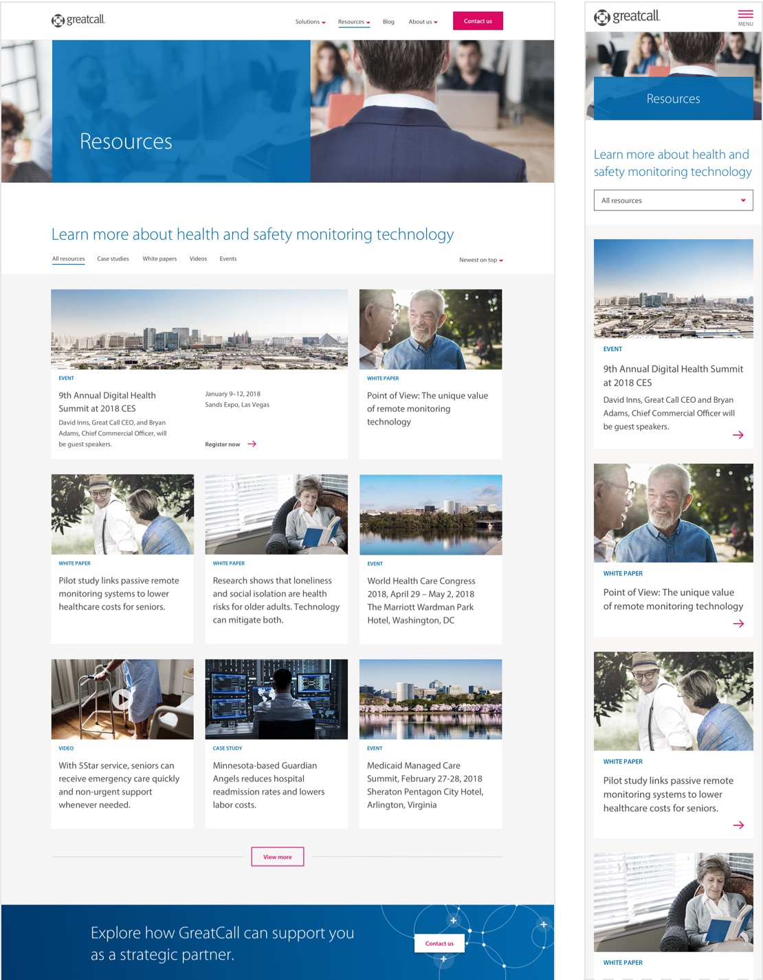
I designed a simple, intuitive destination to sort and filter through resources. This included resource detail templates to support a variety of content. These were designed to be easy for the client to update and for a consistent experience. Resource cards were also placed strategically throughout the site to promote relevant content for lead nurture.
Building the experience
The website was coded by the client’s developers. We had several collaborative sessions to ensure feasibility of recommendations and a smooth translation of the design and functionality. I designed and handed-off assets in batches to meet tight deadlines.
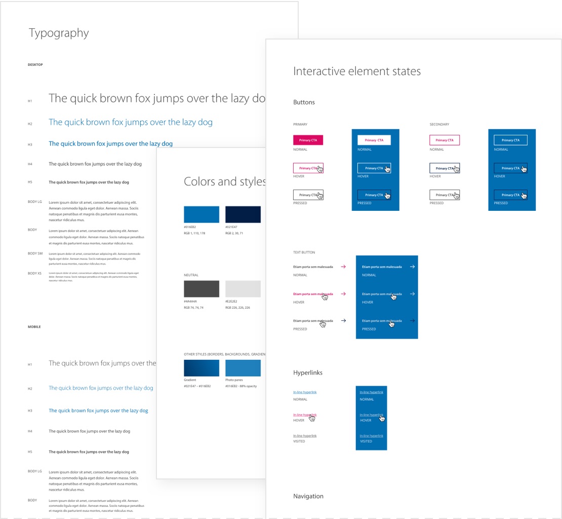
In addition to prepping files, I created a stylesheet to provide guidance on styling and interactions, and to ensure consistency.
Results
The client was thrilled by the new online destination and the clear and delightful usability. The company was shortly acquired by Best Buy.