Career Guidance System
The Career Guidance System was a comprehensive career guidance and job-seeking platform for our 1,000,000+ students and alumni worldwide to connect their education to their career goals. As part of our cross-functional in-house team, I dedicated several years as the lead (and sole) product designer from conception through multiple releases.
The challenge
Our target audience was our students and alumni—older, non-traditional, and working learners. Student success was our top priority, and this was dependent on improving retention, increasing completion rates, and focusing on career outcomes.
- Many students had trouble defining their career goals and dropped out prematurely
- Many students lacked job-seeking skills and resources
- Our career tools had a poor user experience and were not being used
- We needed to improve employment outcomes for our students and our employer partners
- We needed to improve mapping career goal skills with university offerings
The solution
Our solution was a comprehensive career platform that would provide our 1,000,000+ students and alumni worldwide with tools and support to help them research and define their career goals, build job-seeking skills and map them to our offerings, and find employment.
ROLE
Lead Product Designer
Creative Direction
Brand Development
MY DELIVERABLES
Information architecture
User flows
Wireframes
Brand development
Interactive prototype
Design system
Usability testing
CLIENT
Apollo Education Group
One of the world’s largest private education providers, serving students and employers through its global education network.
The process
For several years, I collaborated with a cross-functional team of engineers, developers, researchers, and product leadership to design and evolve this platform from the ground up. We worked iteratively, with daily stand-ups and sprints of two to three weeks.
We initially launched by releasing tools one-by-one and then added milestones to connect the experience.
We consistently used my prototypes for user testing, where we identified issues and opportunities. Product refinements evolved from prioritizing user feedback as well as business strategy.
Setting the mood
I created moodboards to set the visual direction for our product, maintaining the integrity of our brand while giving this a unique identity. My explorations ranged from minimal to symbolic to expressive. The selected concept was a fusion of symbolic and expressive—each milestone was color-coded with a branded icon and expressive illustration. This engaging approach also strengthened the users ability to distinguish milestone content.
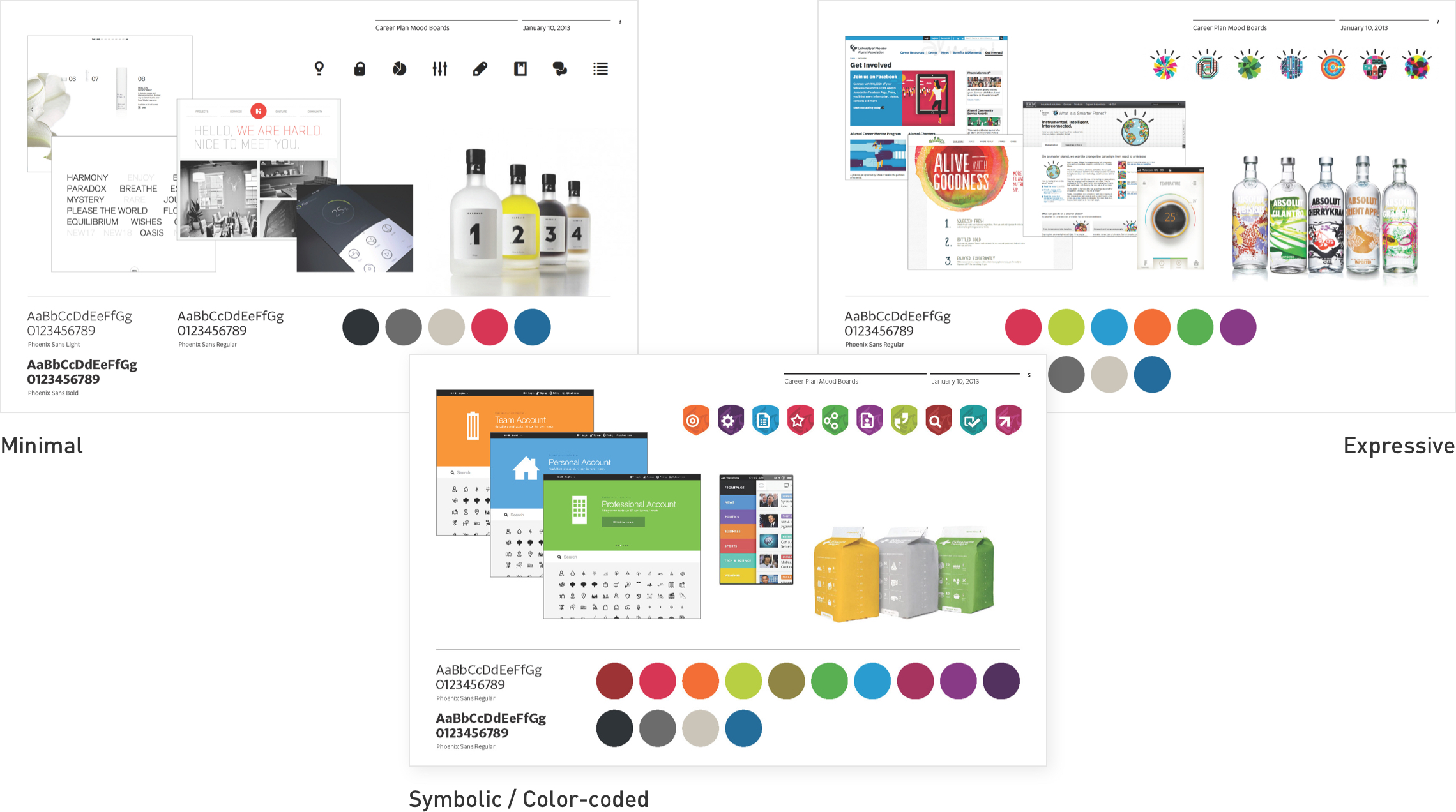
Exploring concepts
Through researching user’s needs and card-sorting exercises, our team identified 10 milestones that served as the global navigation for the system. I created style tiles to show how these could be uniquely identified, as well as several mockups. I selected three unique pages to best display the breadth of options—the dashboard, one of the 10 milestones, and a tool. My goal was a clean and intuitive experience, ensuring milestones and status were easy to identify and navigate. We commissioned an illustrator to work on the 10 milestone hero illustrations.
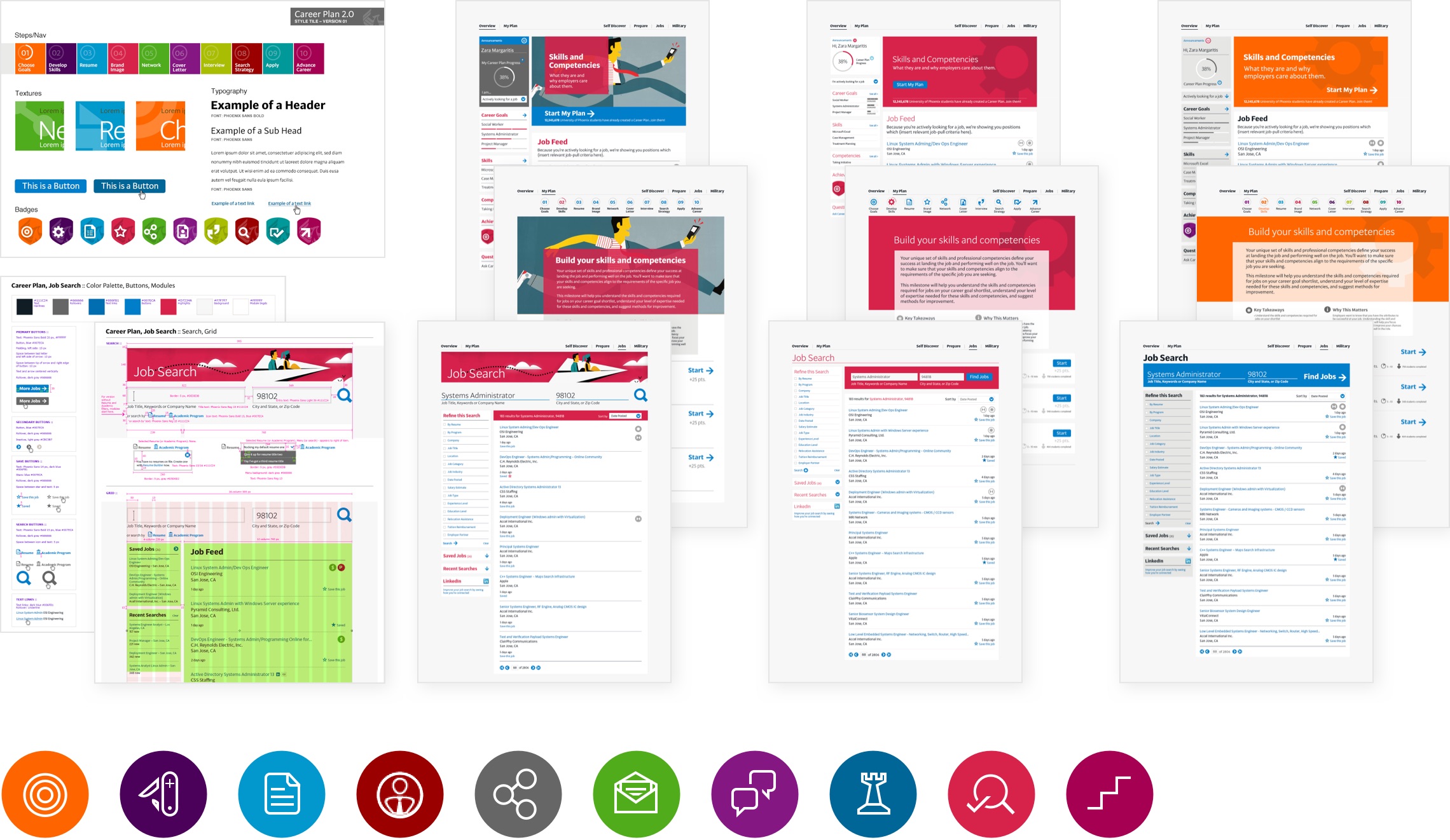
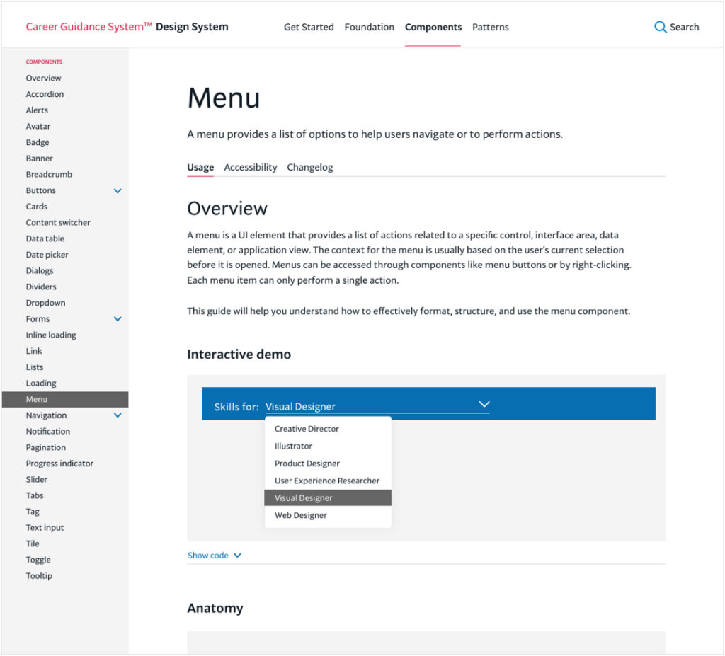
Design system
I created and maintained a fully custom design system that complemented our brand and met accessibility guidelines. This system of accessible design components and styles supported consistency, efficiency, and scalability. This allowed us to scale and test quickly and provide a consistent user experience.
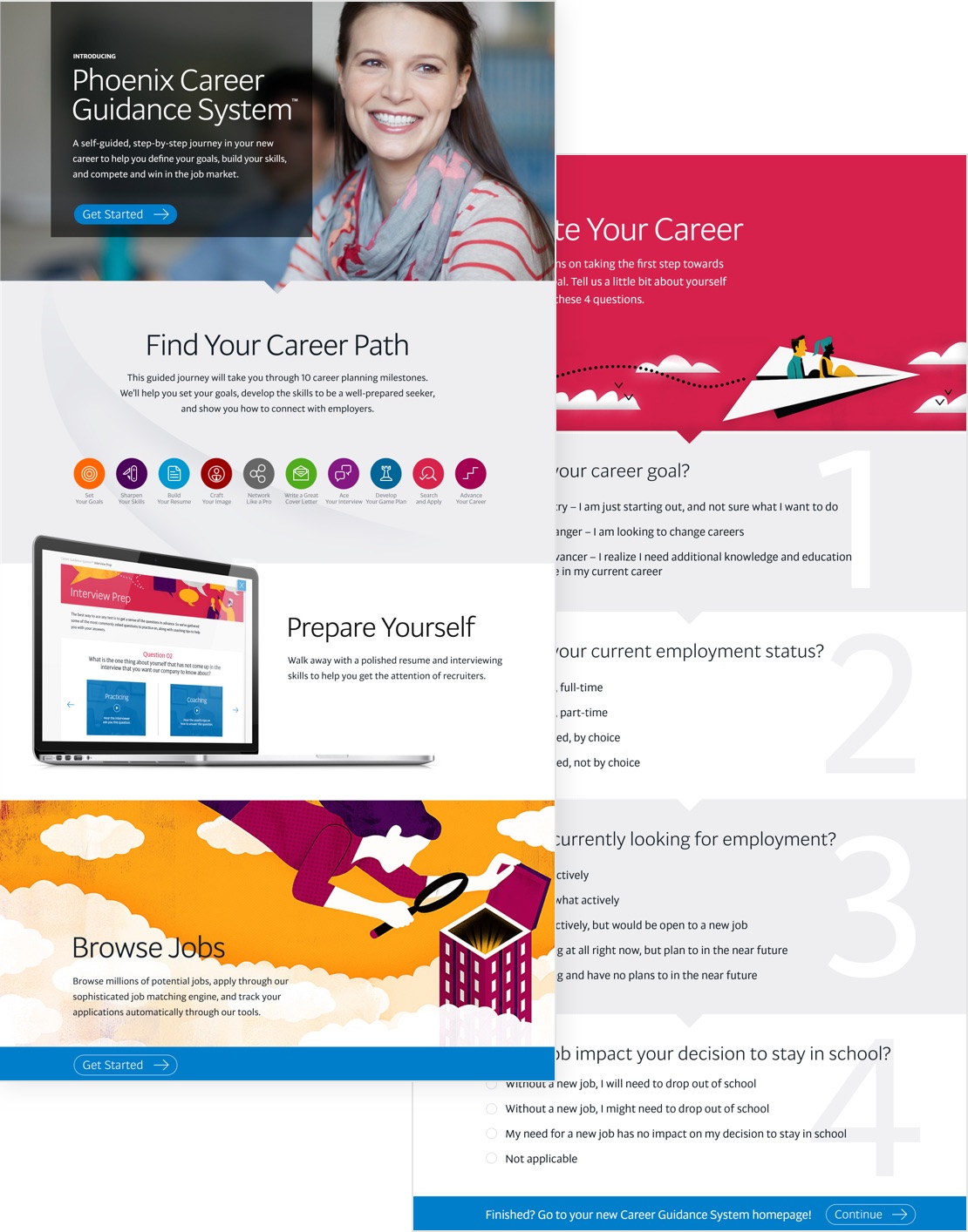
Introduction + personalization
I designed a compelling landing page and subsequent survey that introduced students to the system and personalized their experience.
Our team conducted usability testing to compare mockups and messaging and determined that this landing page greatly enhanced their understanding and user experience.
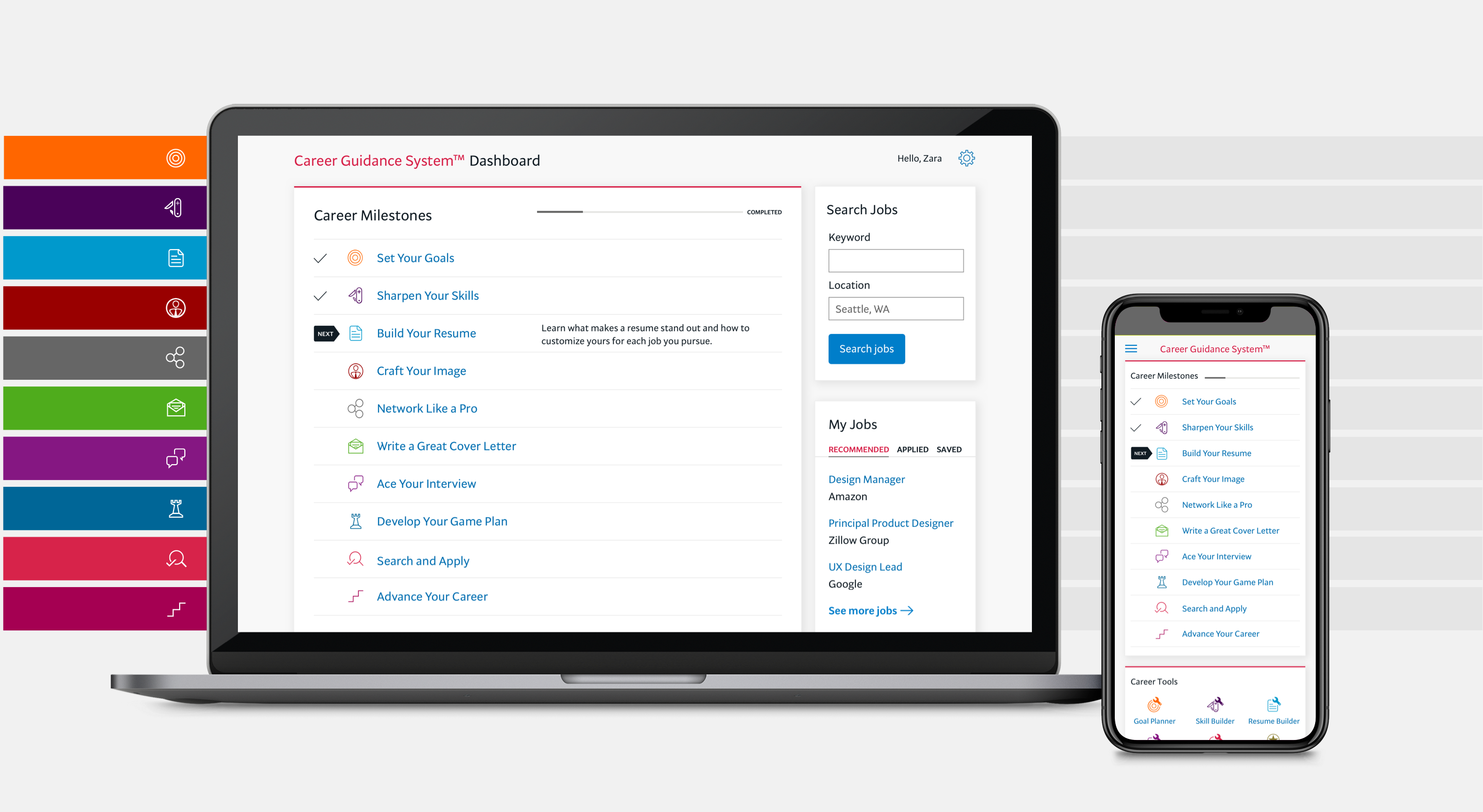
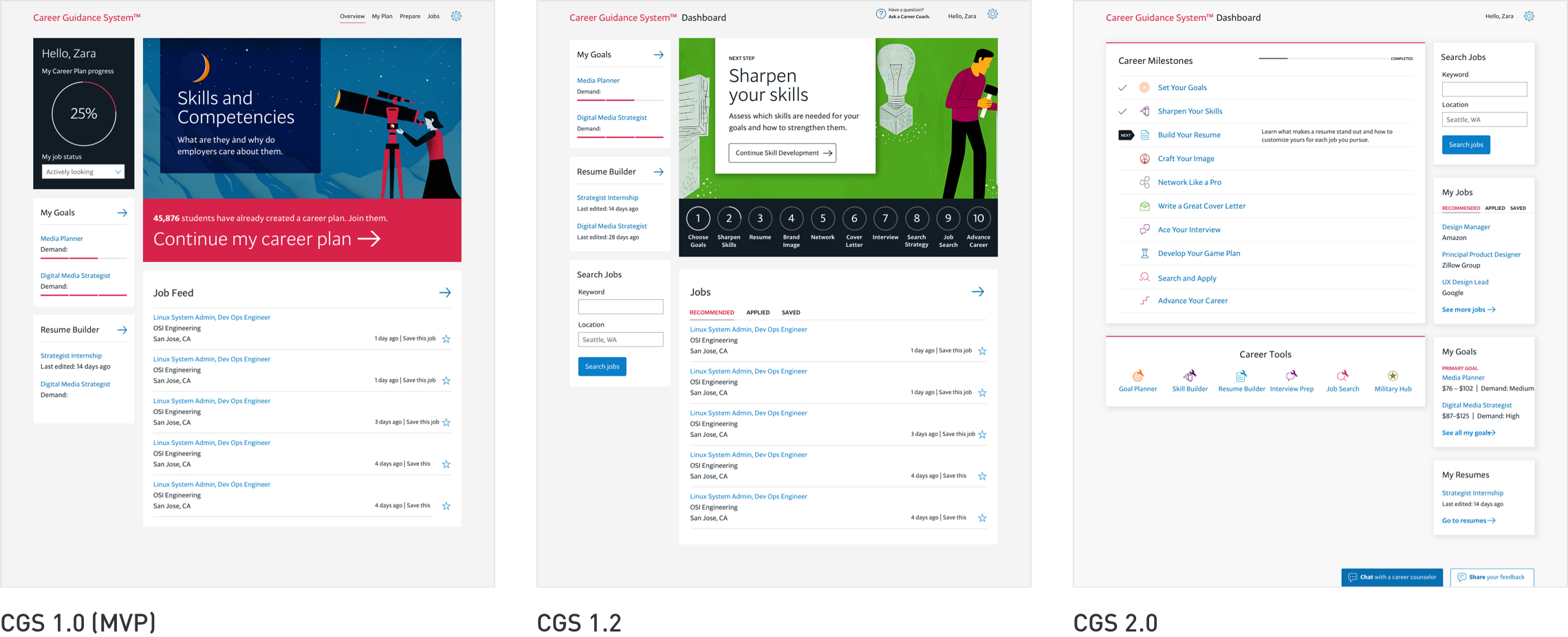
Dashboard evolution
We tested and refined the dashboard extensively, prioritizing user feedback. It evolved from initially featuring a few tools to an ecosystem of milestones and features.
- Evolved to a step-by-step platform with milestones and badging to guide and engage users
- As users engaged with the platform, the dashboard evolved to highlight their progress and prioritize content that provided the most value
- The business model evolved to white labeling the product and simplifying branding customization
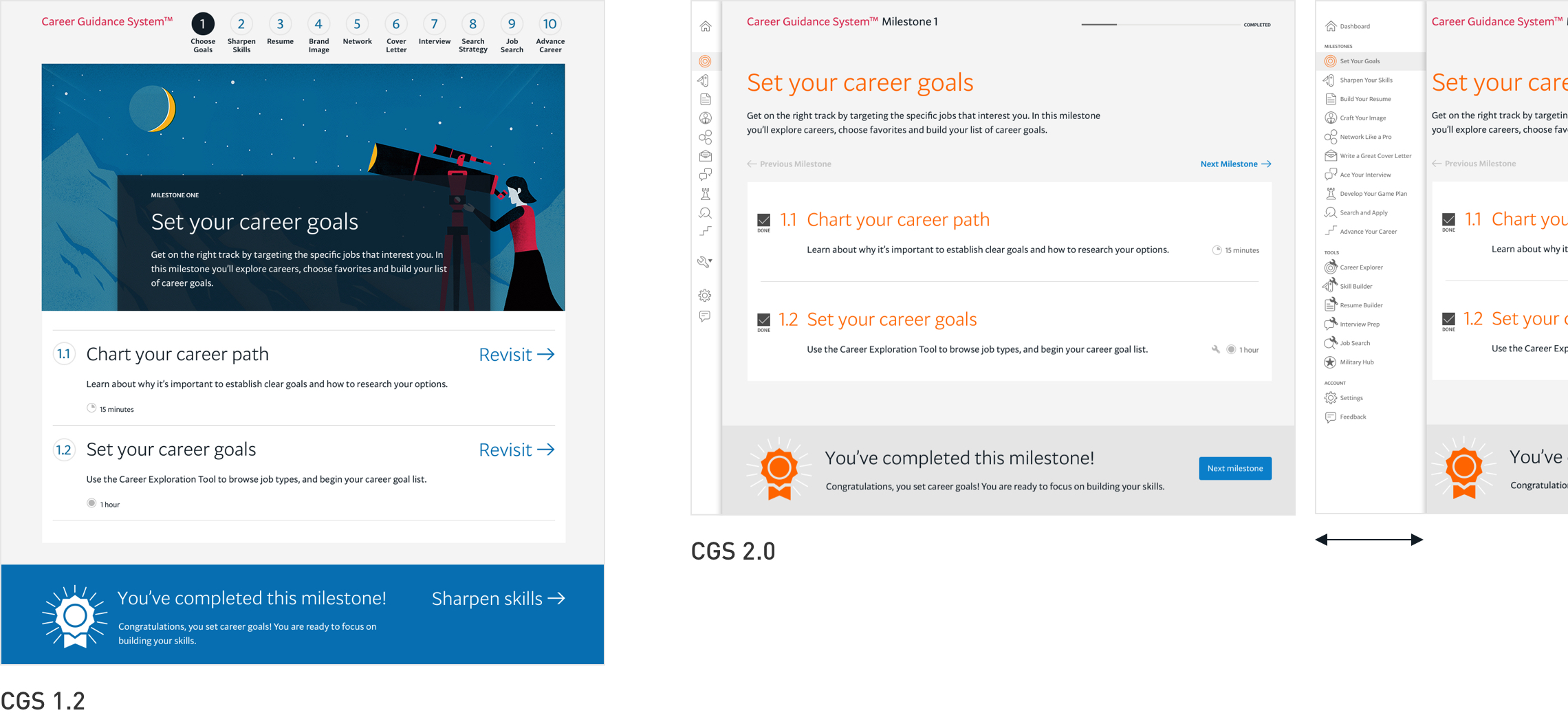
10 milestones + navigation evolution
The introduction of milestones had a significant impact on how users interacted with the platform. There were 10 milestones, each with a corresponding page that had multiple steps. Steps and milestones were checked off when completed, and progress was always visible. Gamifaction resonated with our users, so we added earning badges when each milestone was completed.
A significant evolution was changing the numbered navigation at the top to an icon-based navigation drawer on the left that expanded on hover to reveal labels. Originally, each step opened a new page, but usability studies revealed that this was confusing to users. After numerous prototypes and testing, our solution was to keep users on each milestone page—steps became accordions to expand content, and tools opened a panel that slid on top of each milestone page. Micro-ineractions also improved this user experience.
Suite of tools
I designed all five tools that were linked to guided steps in the user journey. Through user testing and business objectives, these evolved to include more valuable features and to improve usability. My goal was an engaging, intuitive, and consistent experience.
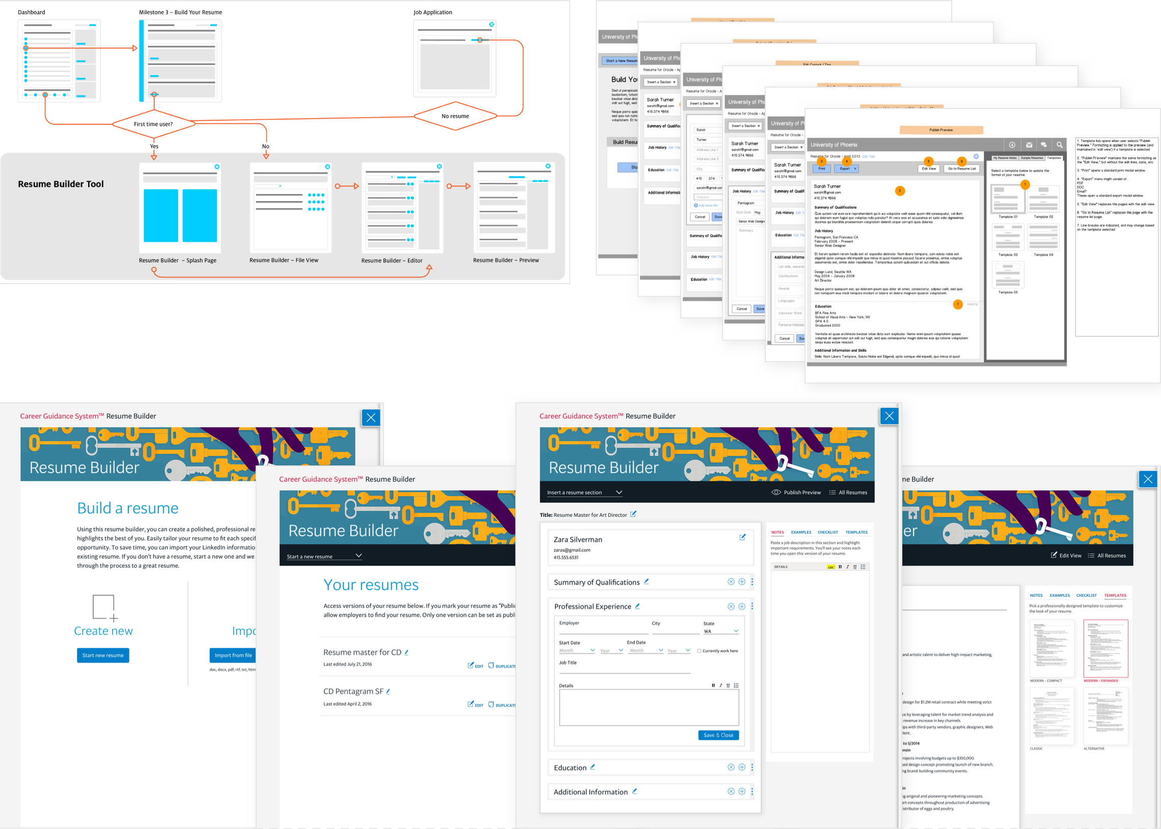
Resume builder
My approach was to analyze user data, research all existing online resume builder tools, prioritize which features would be the most valuable, create user flows, create wireframes, and design the prototype.
- Added what I didn’t see in competitor tools—tips in context that helped educate users on how to complete each resume section
- Designed a side panel for resources that users identified as most helpful—user notes, relevant resume examples, and templates
- Evolved to seamlessly integrate with our job search tool, simplifying applying for jobs
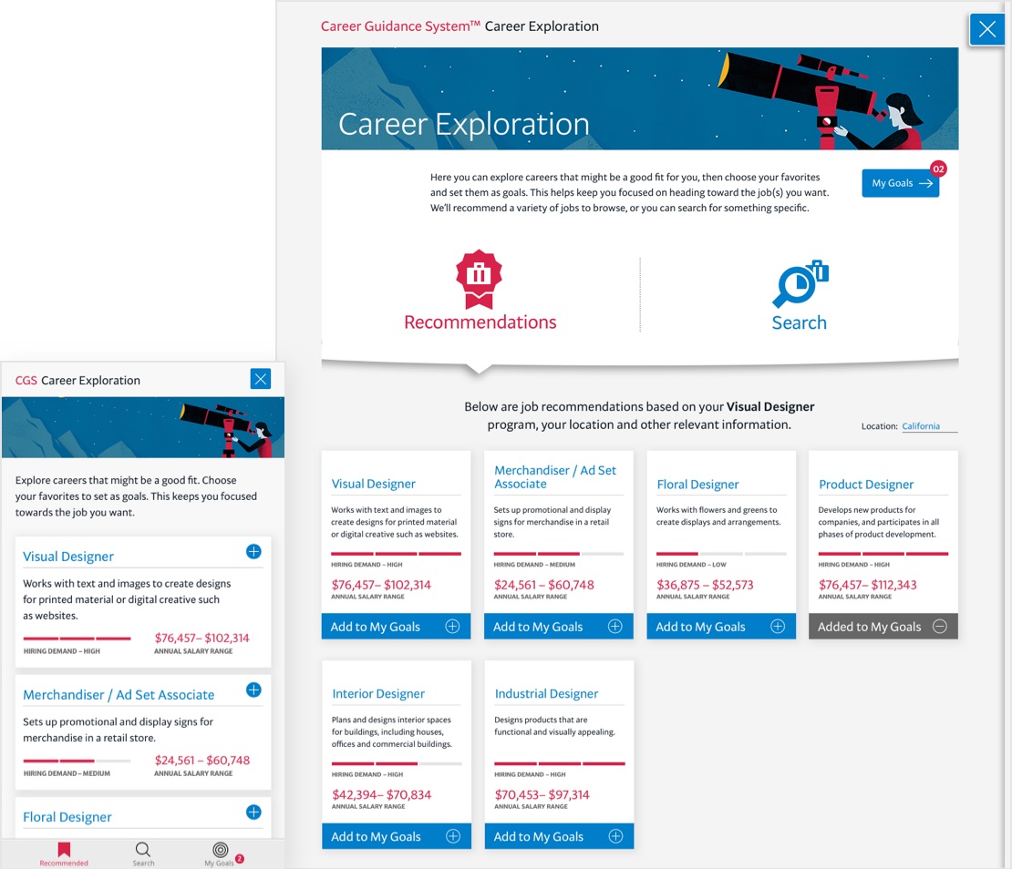
Exploring careers and setting goals
This tool was the initial step, and it was critical for students to identify their career goals since all platform content was personalized to align with this.
- Labor market data helped students make more informed choices about their career goals
- Card format helped users quickly browse and compare careers
- Detailed career pages included education requirements and tuition estimates that helped students plan their education
- Military students could translate their experience to civilian occupations
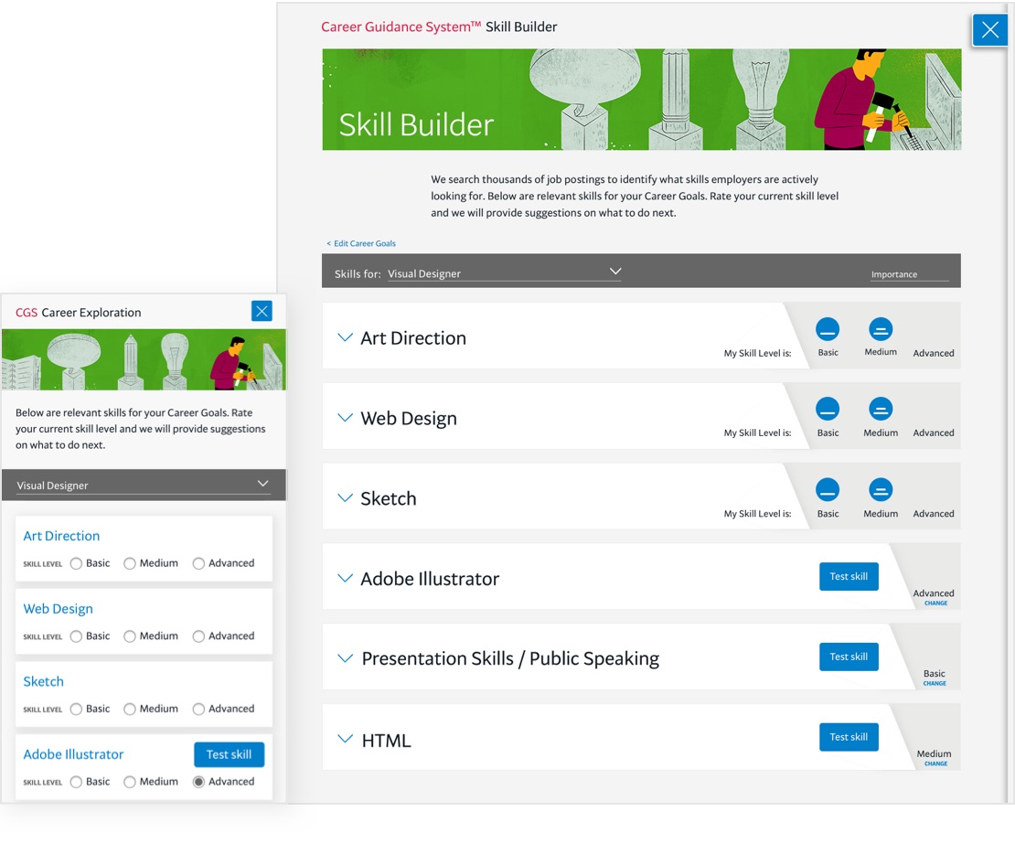
Building skills
This listed skills needed for a selected goal. Students were able to get a professional rating of their skill level and education recommendations to strengthen gaps.
- Listed which skills were important for a selected goal and pulled skills from active job postings for accuracy
- Increased user engagement by self-assessing each skill and testing level of proficiency for a realistic comparison
- Education recommendations to strengthen each skill that mapped to and promoted our school offerings
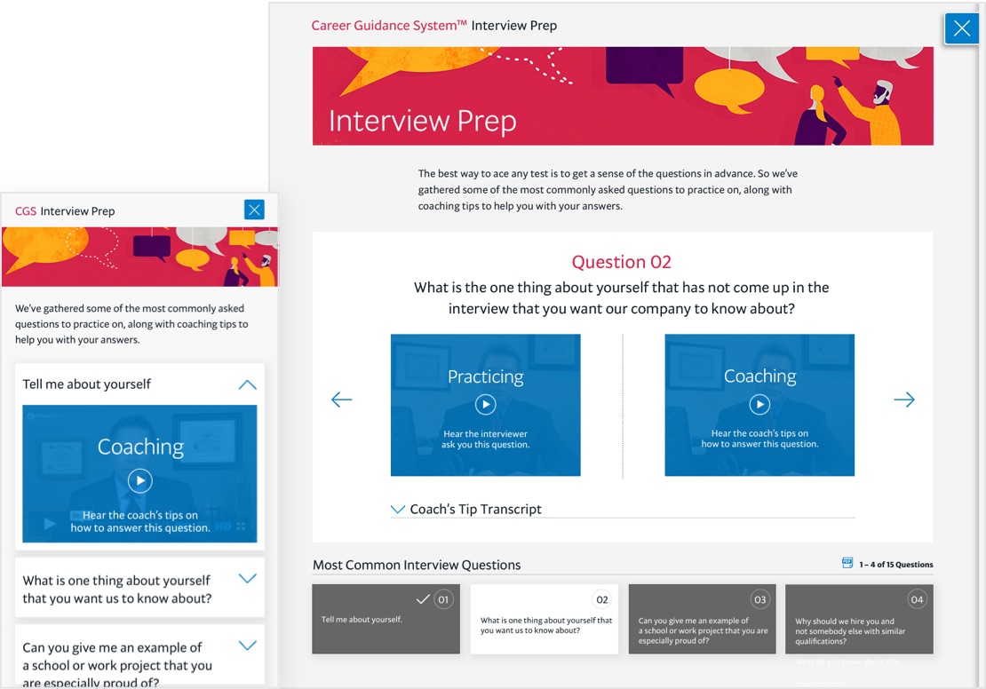
Prepping for interviews
This tool provided an interactive interview prep with videos for interview questions and suggested answers.
- Video format for interview questions (with transcripts) and suggested answers helped engage users
- Evolved to allow users to record answers and submit them to a coach for evaluation
- Searchable database with thousands of interview questions helped users narrow down by relevant industry
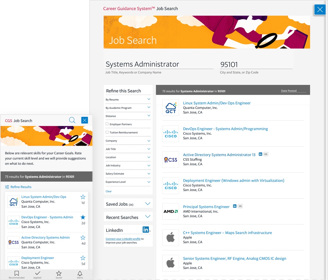
Searching and applying for jobs
This tool aggregated thousands of job postings with robust search and application features to help students find and manage job search efforts.
- Differentiated from other job search platforms by highlighting employer partner jobs and tuition reimbursement employers
- Advanced search and filter capabilities, setting alerts, and recommendations based on skills helped personalize results
- Saving jobs, viewing search history, and tracking the status of applications helped users manage their employment efforts
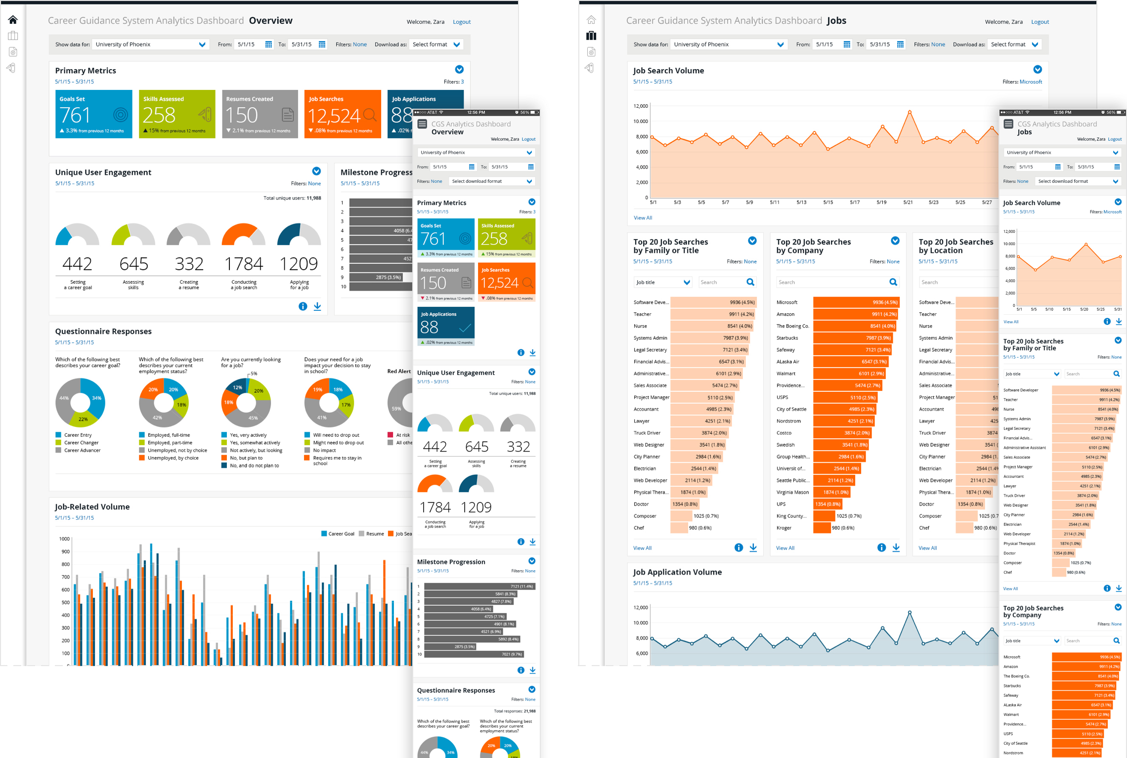
Analytics dashboard
I designed the user interface for an administrative tool to gather and analyze data from the Career Guidance System. My goal was to visually align it to the product experience and make it engaging and easy to understand.
- Duplicated the interactions, UI patterns, and color coding from the Career Guidance System for an intuitive and consistent user experience
- Simplified complex data—essentially a game-changer for our team compared to their previous laborious process of spreadsheets to interpret data
The outcome
Overall, this product was a great success. It led to measurable results for student success and career outcomes and for targeted growth.
Increased student retention
Students were better equipped to research labor market data, set career goals, and map skills needed with university offerings to reach their goals.
Improved employment outcomes
Students and alumni were able to improve their job-seeking skills by practicing and being coached for interviewing, building their resumes, and searching and applying to jobs.
Best-in-class career platform
When this launched, it was the most comprehensive career platform on the market. Throughout several releases, with improvements reflecting user feedback and business strategy, it became an indispensable asset.