Product ecosystem for nuclear safety
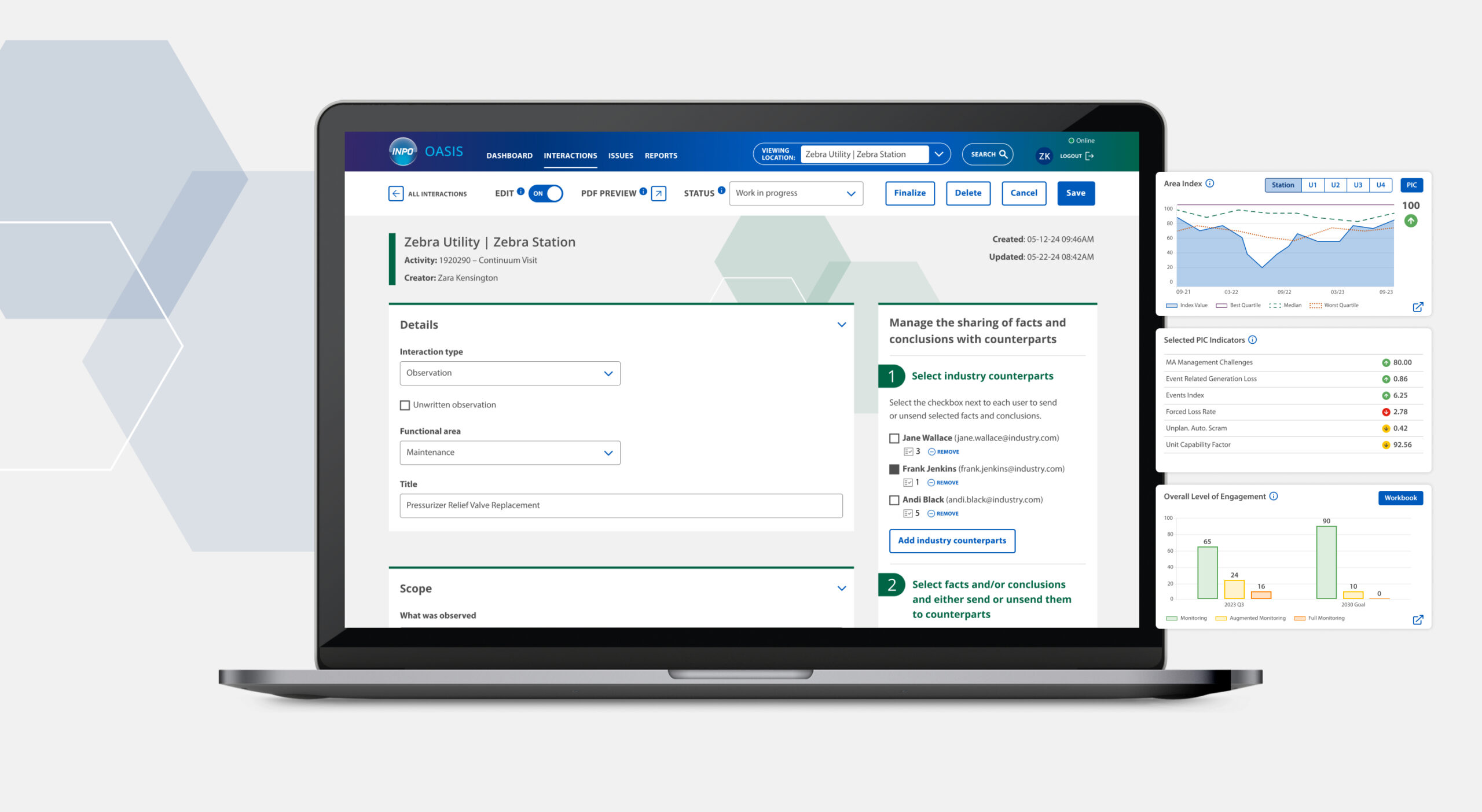
INPO (Institute of Nuclear Power Operations) came to us with a 20-year-old platform that was creating an incredible amount of technical debt and risk as they evaluated nuclear power plants across the globe. I designed a product ecosystem that replaced their outdated platform, ensuring that INPO’s tools matched their expertise in critical evaluations of commercial nuclear power plant operations.
The challenge
INPO’s existing applications were not only inefficient but also hindered critical cross-operational work and collaboration both internally and externally.
- Evaluation workflows were scattered and required excessive duplicate manual work
- Lack of critical collaboration capabilities between INPO and station counterparts
- Creating reports lacked important integrations and wasted a lot of time
- The file management system lacked intuitive upload capabilities and robust filtering capabilities
- Impact dashboards were poorly organized and had limited insights
The solution
A new product ecosystem that replaced their outdated platform and increased operational efficiency, improved the user experience, and provided critical performance metrics.
We started out with an 8-week MVP to redesign their evaluation platform. Our great work led to additional contracts to improve file management, and then redesign and expand impact dashboards.

ROLE
Lead Product Designer
Accessibility SME
MY DELIVERABLES
Information architecture
User flows
Wireframes
Interactive prototype
Design system
Accessibility testing
Product commercials
CLIENT
INPO (Institute of Nuclear Power Operations)
Sets industry-wide performance objectives, criteria, and guidelines for nuclear power plant operations. They conduct evaluations at nuclear stations and identify strengths and areas for improvement.
Defining user needs
Through user and stakeholder interviews, alignment workshops, and co-creation sessions, we built a strong foundation. We also had demos of existing tools, which helped me evaluate current capabilities and determine which features were essential to the MVP.
One of my achievements was to quickly understand the complexity of an industry that I had no experience with, and design intuitive and valuable solutions.

Untangling the complexity of user flows
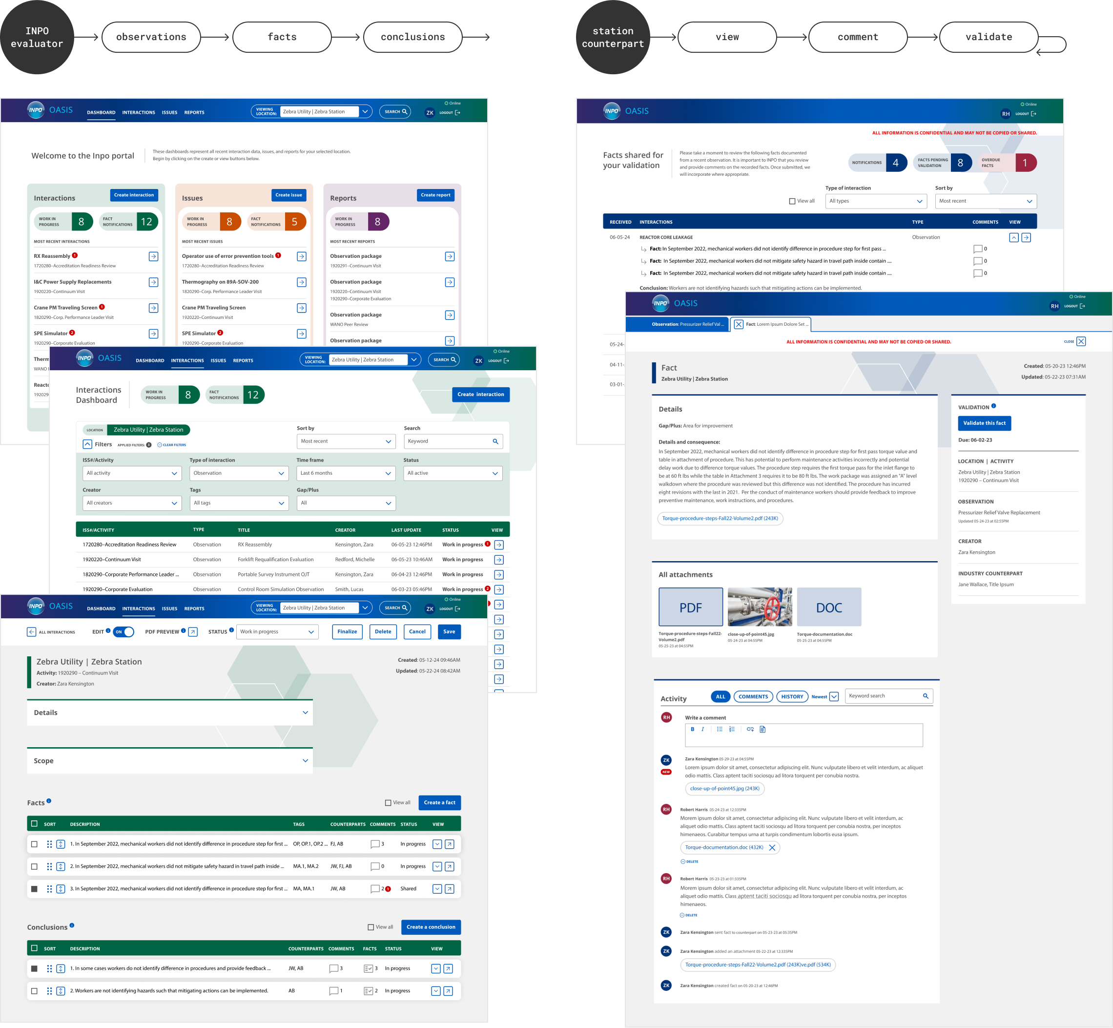
Understanding complex user flows both for INPO and their station counterparts was essential. There was no existing platform for the counterpart, so part of the challenge was determining how both types of users would collaborate on this platform and what the evaluation validation process would look like.
I led the stakeholders in a collaborative session of my user flows to get feedback and fill in any gaps. I also presented my information architecture to set the foundation for features and platform structure.

OASIS—Streamlining evaluations and adding collaboration capabilities
OASIS became the integrated platform for streamlined nuclear power plant evaluations and reports, and included previously non-existent collaboration capabilities for both internal and external users.
Tackling the two most critical problems for the MVP
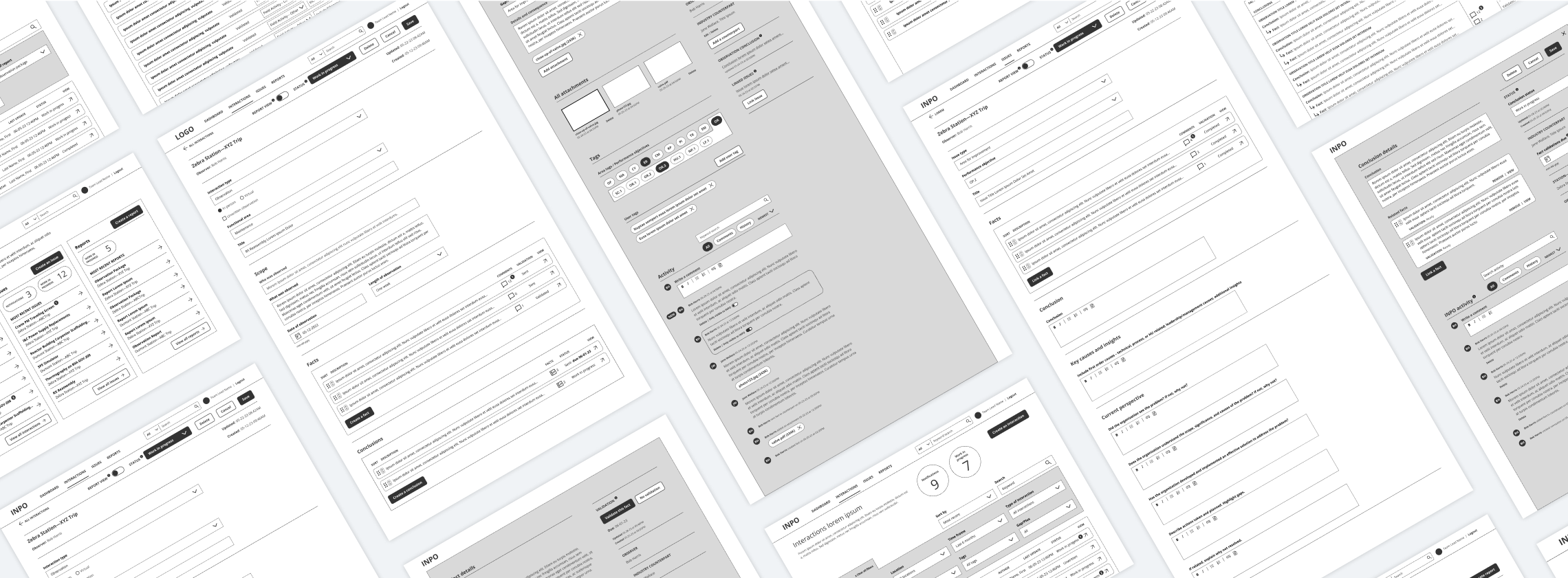
Once the foundation was set, I created high-fidelity wireframes in Figma to sort out details for each page.

The evaluation process is inefficient and frustrating
What I proposed: Centralize management and creation of evaluations and reports with dashboards, simplify evaluation steps and automate form types, offer flexibility of both scannable and granular views to support work styles, and add activity panels for comments, attachments, and historical data.

Lack of critical collaboration within INPO and with nuclear station counterparts
What I proposed: Management of counterpart assignments and permissions, workflow to share and validate evaluations, actionable alerts and status, and the ability to comment with privacy controls.
Bringing the vision to life with a clickable prototype
Once we had approval of wireframes, I explored a creative direction and designed an interactive prototype in Figma. Brand guidelines were very limited—as was my time, so I focused on expanding essential brand elements. These are some of my solutions:
- Color-coded the three primary sections to differentiate duplicate layouts
- Improved management and creation of evaluations and reports by adding a dashboard for each primary section, with robust search and filters
- Simplified steps to fill out evaluations and established a clear hierarchy to guide users
- Improved engagement by supporting flexible work styles with options to quickly scan content or to get granularity by expanding to separate tabs
- Huge impact by adding collaboration capabilities for both internal and external users
- Added an activity panel to each evaluation for comments, attachments, and historical data
- Eliminated duplication by sharing the same evaluations but with privacy controls
- Actionable alerts and status to improve managing evaluations
- Management of counterpart assignments and permissions
CAPRI—Improving file management
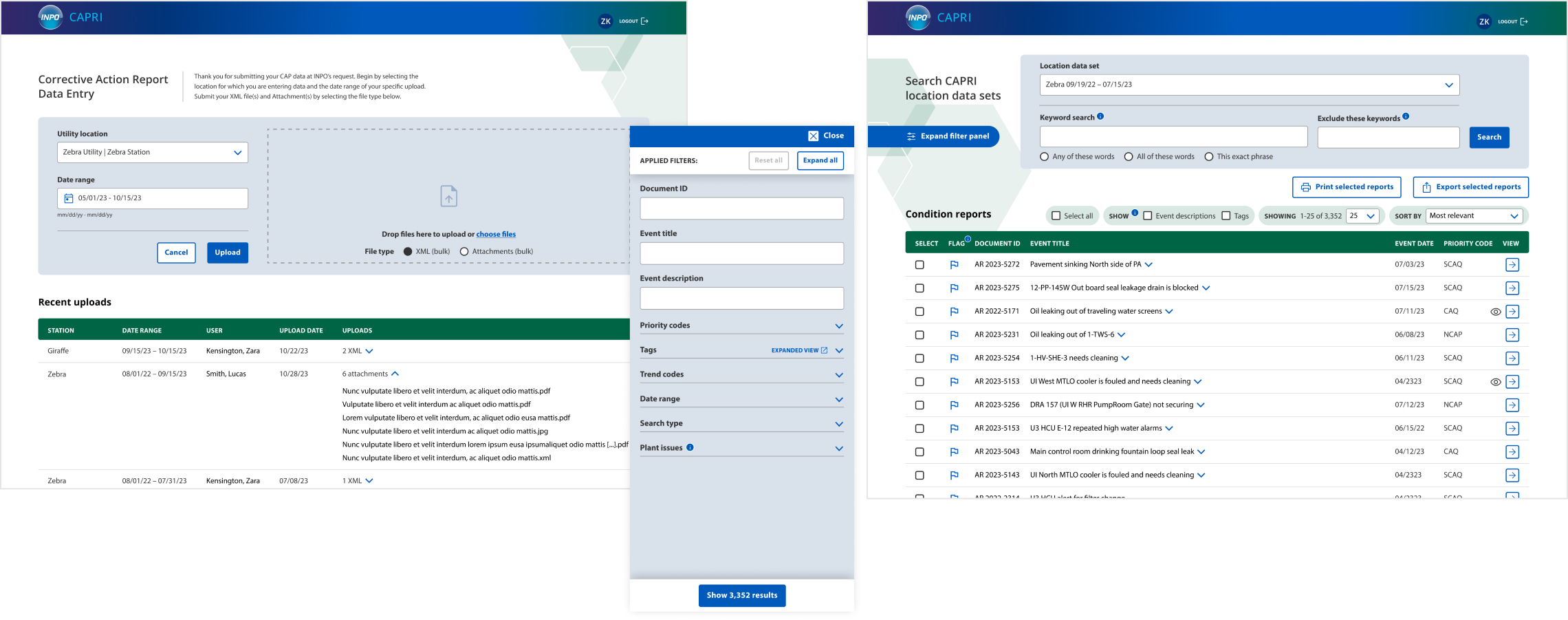
CAPRI became the updated platform for uploading and managing files from station counterparts. These are some of my solutions:
- Improved engagement by adding robust filters and search capabilities
- Evolved the process for uploading files to be clearer and align with expected UI patterns
- Improved scannability with clearer hierarchy and progressive disclosure for more detailed views
Continuum Viewer—Critical cross-functional impact dashboards
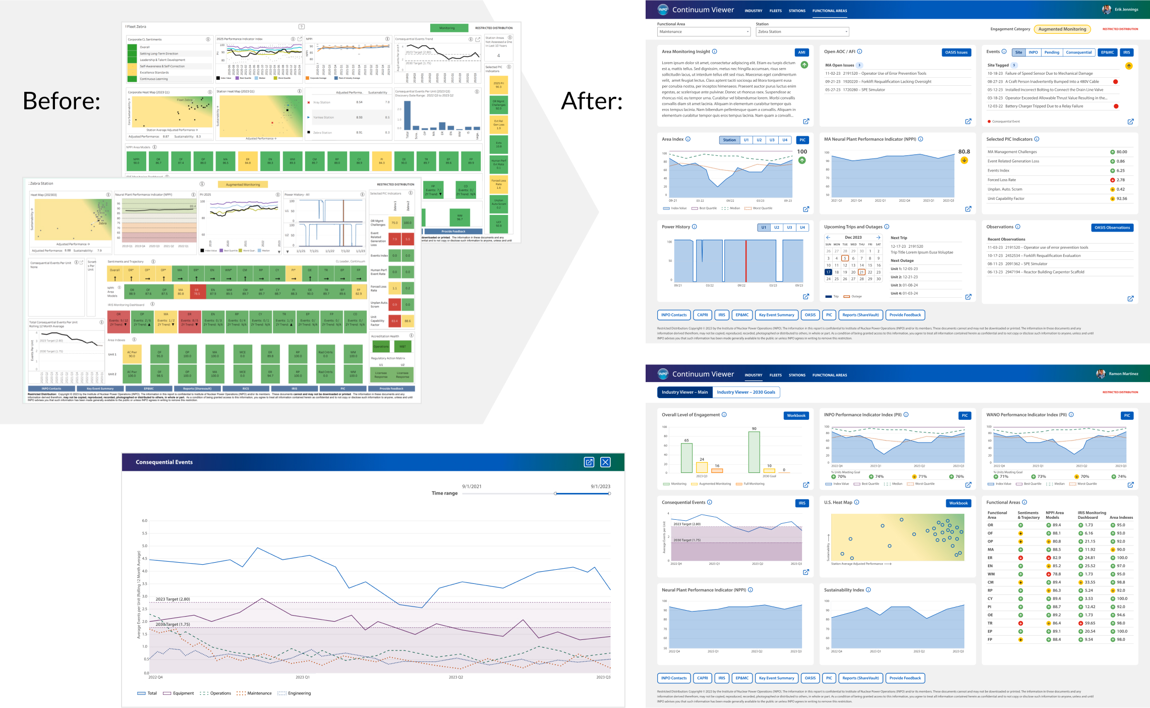
INPO lacked a central location for cross-functional views that told a story with their data. I designed Industry and Functional Areas impact dashboards, and tied the experience to existing Fleet and Station impact dashboards. The success of my solutions for organizing and elevating data visualizations and insights would also be applied to existing dashboards.
Four-week marathon
Nuclear data was very complex, time and stakeholder availability were limited, and the path to success involved significant collaboration with INPO stakeholders. For functional area dashboards, we agreed to focus on one user with cycles of rapid prototyping and feedback. I also used a Tableau UI kit for efficiency.
“We hate the colored boxes.”
The two current dashboards had a lack of visual hierarchy, poor organization, and weak data visualizations and insights. The clients emphasized how much they hated “the colored boxes,” but keeping color coding was important. I focused on organizing, simplifying, and selecting the most appropriate data visualizations. They loved my simple and impactful solutions!
Impact dashboard solutions
- Organized key contributors and insights at multiple levels (Industry > Fleet > Station > Functional Area) and for a range of users (C-suite executives to evaluators)
- Balanced a combination of models and metrics to accurately provide a picture of past, present, and future performance
- Showed top contributors to changes in performance and connected this to sustainability goals
- Evolved data visualizations to provide better insights, and simplified and clearly organized them to improve engagement
- Supported versatile user needs by adding multiple views and filtering for more comprehensive alternatives
Accessible design system
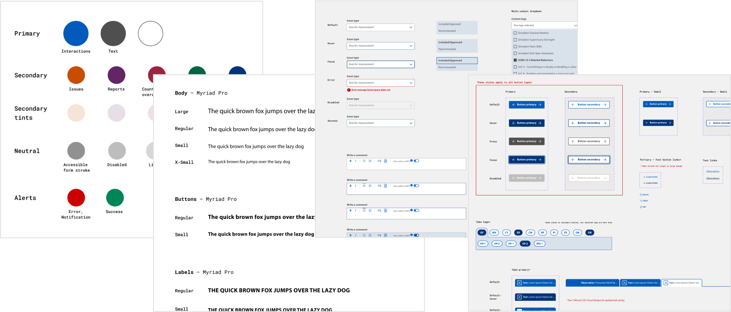
I created a fully custom design system that evolved the client’s brand and met accessibility guidelines. This system of accessible design components and styles supports consistency, efficiency, and scalability. This ensured that the products that I designed for the ecosystem had consistent styling and interactions.
Validating with our users
User adoption was critical to the success of these products. My interactive prototypes empowered us to conduct qualitative testing with users and gain valuable insights. Critical insights were prioritized so that I could design solutions for the MVP.

The outcome
A new product ecosystem that replaced their outdated platform and increased operational efficiency, improved the user experience, and provided critical performance metrics.

Increased operational efficiency
Streamlined processes reduced time to complete tasks by over 30%, significantly enhancing productivity.
User adoption
Feedback from INPO team members highlighted improved ease of use and effectiveness in daily operations.
Critical cross-functional views to evaluate performance
The ability to see data of key contributors and insights of performance at multiple industry levels and for a range of users, from C-suite executives to evaluators.