Integrated EHR platform with AI support
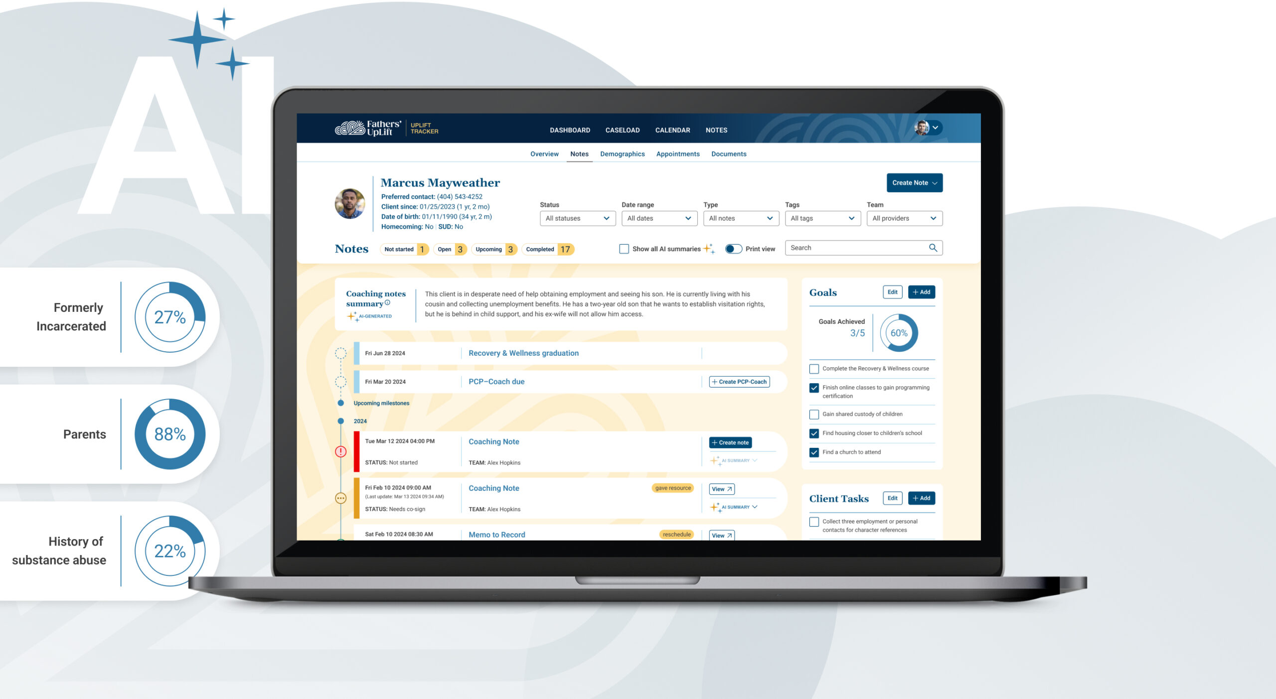
Fathers’ UpLift provides mental health counseling and coaching to assist fathers with overcoming barriers that prevent them from remaining engaged in their children’s lives. I designed a custom EHR (Electronic Health Record) with AI enhancements to improve operational efficiency and insight metrics.
The challenge
Father’s Uplift came to us after working with another agency for over two years with no progress in addressing users’ needs. They continued to juggle multiple tools to support workflows, and they had lost trust in the process.
- Off-the-shelf EHRs did not meet the needs of providers
- Fragmented solutions reduced the ability for insights and metrics, and caused underbilling
- Traumatized by relationship with previous agency and apprehensive to invest more money and time
- 8-week MVP to prove ourselves and secure additional funding from shareholders
The solution
Design a single hub that can support complex provider workflows, centralize metrics for insights, and lead to better patient engagement.
For the initial 8-week MVP, we collaborated with our clients to assess user needs and business strategy, prioritize core features, and determine technical feasibility and integrations. The goal was to design an impactful prototype to secure additional funding.
ROLE
Lead Product Designer
Accessibility SME
MY DELIVERABLES
UX/UI audit + Consultation
Research
Information architecture
User flows
Wireframes
Interactive prototype
Design system
Accessibility testing
Product commercials
CLIENT
Father’s Uplift
The country’s first mental health and substance use treatment facility for fathers and families.
Bad news, good news
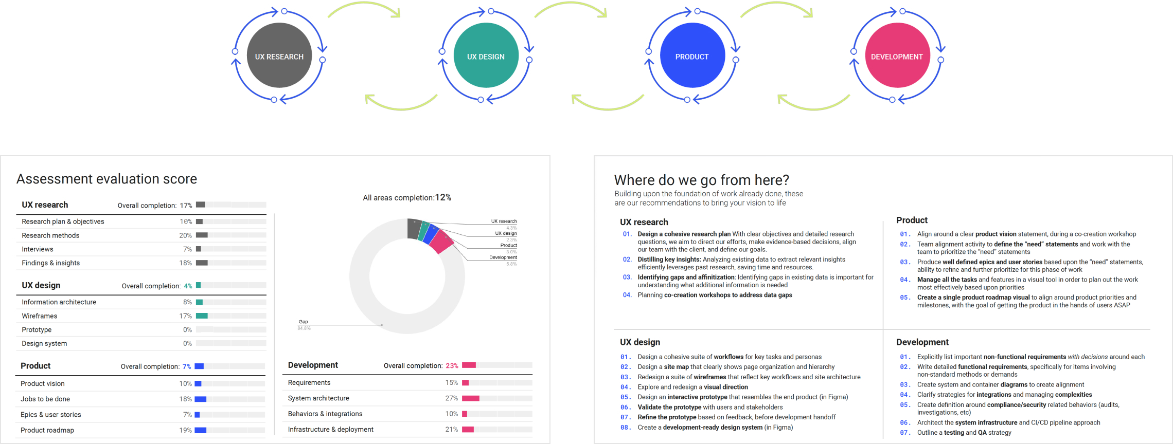
The client initially hired us to audit the previous agency’s work to access the quality and identify gaps.
How do we prove our expertise, educate on our process, and earn trust?
I took the initiative to strategically format a presentation deck. My approach was to present content by discipline and then process, explain meaning and value, formulate a scoring system, and finally offer recommendations. I was also responsible for auditing and presenting findings for the UX design phase.
Scored an 8-week MVP—challenge accepted!
It’s a shame that the quality of the previous agency’s work scored very poorly, but the quality of our presentation earned our client’s trust and an initial contract.
Ready, set… strategic alignment
With such a quick turnaround, we kicked off with an alignment workshop to distill the team’s strategic goals, define personas, understand the current product ecosystem, and prioritize goals.
What would provide the most value within our scope?
We agreed to focus on coaches as the primary user for the MVP. They had the most complex workflows, struggled to complete patient notes, and a lack of insights affected quality of care.

Scrappy but mighty
The client was exhausted from the previous agency’s research efforts, so we decided that facilitating co-creation sessions would be the most engaging and effective approach. We also used existing interviews to understand user processes, pain points, and needs.
Let’s go with the flow
I led the clients in a collaborative session to review my user flows that followed a patient’s journey alongside a coach’s tasks. This saved us a lot of time compared to our typical process and allowed us to confirm critical information. I also presented my proposal for the site map to align with the platform structure.

Technical feasibility
I collaborated with the Director of Engineering to determine integration strengths and limitations, as well as the effort involved in adding specific features and generative AI. This did affect how I approached some of my solutions, but I maintained the integrity of the user experience.
Falling for… wireframes
Once I understood user needs, business goals, and technical considerations, I created high-fidelity interactive wireframes in Figma to get approval of key pages and functionality.
Tackling the top three most critical problems

Coaches struggle to complete patient notes because of inefficient workflows
What I proposed: Make note-taking centralized and more intuitive, automate redundant manual processes, and use generative AI to support efficiency and insights.

Lack of centralized patient data limits actionable insights and doesn’t show outcomes
What I proposed: Data visualization—patient progress data on patient profile pages, aggregate of caseload progress and demographic data, and an executive impact dashboard.

Coaches can’t view their caseload or track patient progress
What I proposed: Add a caseload page, highlight most valuable patient data and trends, automatically keep track of appointments and milestones, and incorporate alerts.
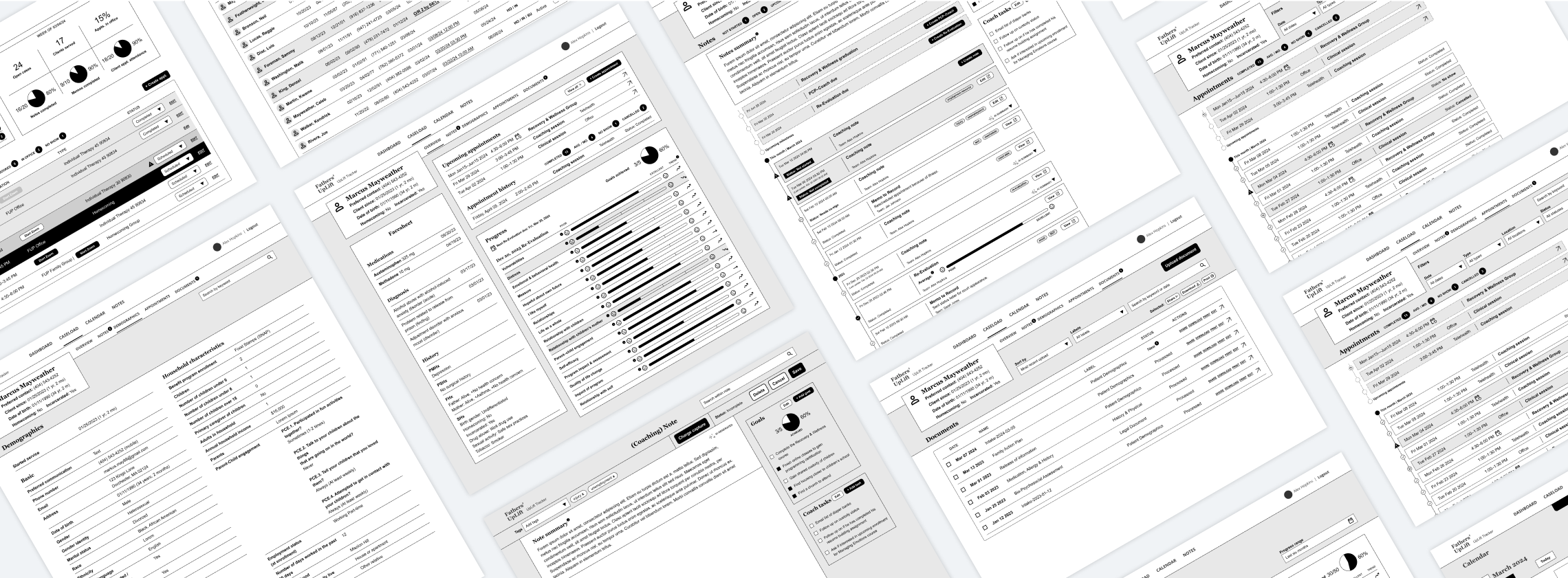


“Delight” is an understatement
As I presented my wireframes to our client, my team noted the looks of excitement and explosion of love emojis. They couldn’t hide their enthusiasm and disbelief. As my team noted…”best client meeting ever!”
“You heard us.”
“This is exactly what we need.”
“You nailed it!”
Bringing the vision to life with an interactive prototype
Once we had approval of wireframes, I explored a creative direction and designed an interactive prototype in Figma. The client’s direction was to make it fun for their providers to take notes, include rich data visualizations, and complement their brand. I used color strategically for interactive elements, and applied softer hues for a friendlier and less sterile clinical aesthetic.
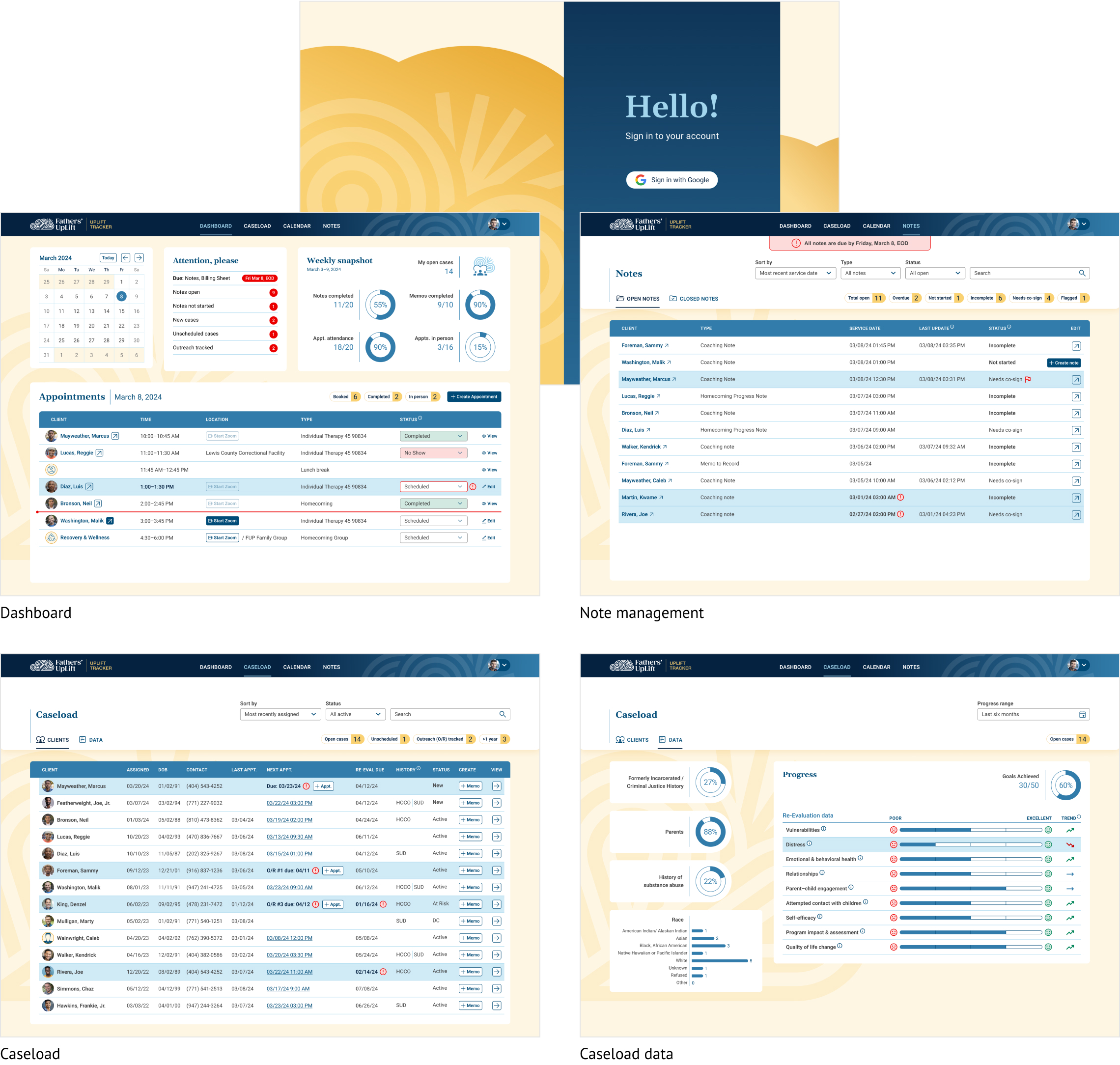
There are essentially two sections—the management of appointments, notes and caseloads, and then individual patient profile pages.
Overhauling management of appointments, notes, and caseload
The previous experience had a dashboard limited to daily appointments, caseload was not listed, and progress required time-consuming digging through a table of notes. These were some of my solutions:
- Added value to the dashboard with alerts to keep track of pending tasks, a weekly snapshot of accomplishments, and clearer appointment status and tracking
- Added the ability to manage caseload by adding a caseload section, automating progress tracking, and highlighting critical data
- Improved patient insights by introducing data visualization for demographics and progress
- Improved the accuracy of billing by integrating appointment management and adding billing code checkpoints
- Increased efficiency by automating mundane tasks such as generating notes for missed appointments and adding AI rewrite
Huge evolution of patient profiles and insights
The previous patient profile pages were limited to a table view of notes that required a lot of effort to dig through for insights and progress. These were some of my solutions:
- Huge evolution from a table view with notes to a more engaging, intuitive, and meaningful user experience
- Innovated comprehension of a patient’s historical relationship by displaying notes and (past and future) milestones as an engaging timeline with status, tagging, and AI summarizations
- Improved knowledge of patient progress and trends by data visualization pulled from quarterly self-evaluation forms and from notes
- Game-changing addition (and consistent visibility of) checklists for goals, patient tasks, and provider tasks
- Increased efficiency by simplifying and auto-populating forms
- Improved awareness of note completion status by adding alerts and placeholders for notes missed after appointment completion
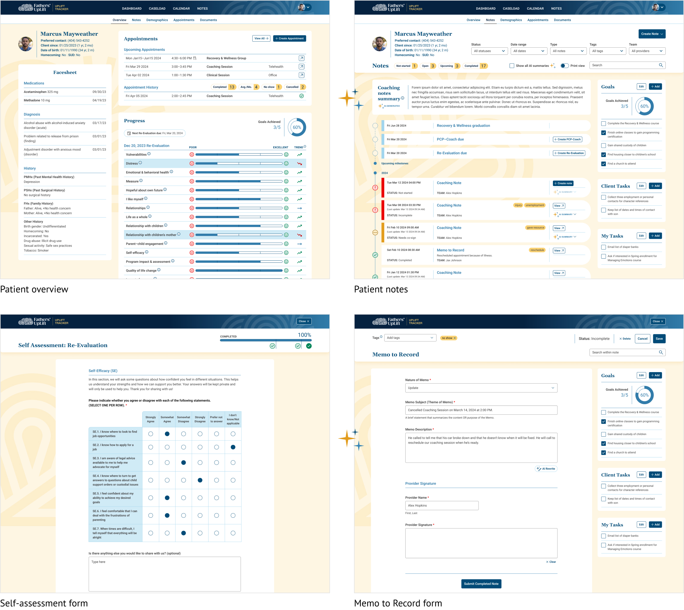
AI enhancements for increased insights and efficiency
I strategically included generative AI that would have the most impact and the lowest hanging technical lift. Since notes were the biggest challenge for providers, I focused on this and what would provide the most value.
AI summarizations
Quickly enables providers to efficiently assess each client’s history and progress with summaries of both individual and collective notes.

AI rewrite
Saves providers time by easily having notes rewritten to a more formal and grammatically correct format.

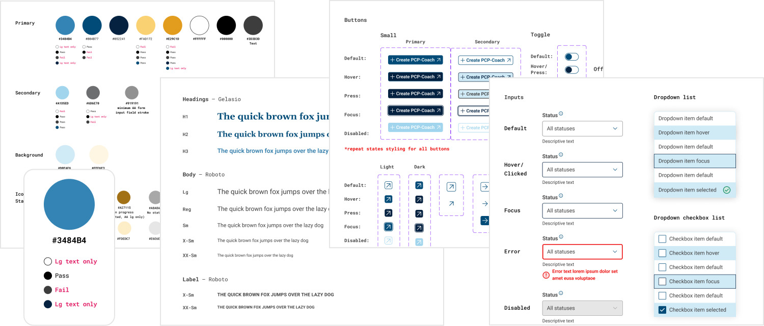
Accessible design system
I created a fully custom design system that evolved the client’s brand and met accessibility guidelines. This system of accessible design components and styles supports consistency, efficiency, and scalability.
The outcome
A single, integrated hub that simplified complex provider workflows, centralized data for insights, and led to better client engagement.
Increased operational efficiency
Made provider workflows more efficient and engaging with intuitive tools, AI support, and valuable new features.
Centralized data for measurement of impact
Centralized data enabled a powerful new ability to measure patients progress over time, track reduced reincarceration rates, and show provider’s impact.
Improved client engagement
Added the ability to easily keep track of patient goals and tasks, better equipped to manage milestones and outreach, and easier to address key historical and future events.
